Lesson 9 - Transparency and Opacity

As if life were not complicated enough there is another quality that is well worth knowing about and that is how transparent (or not) the paint is. This is particularly important when working with glazes where you want the base colour to show through. Clearly if you use a transparent colour on top, the base colour will show through to make an optical mix of both colours but if the top colour is quite opaque it will ‘bury’ the base layer. On the other hand if you want to ‘bury’ or heavily modify the base layer colour then using an almost opaque colour might help; though you might end up muddying the picture.

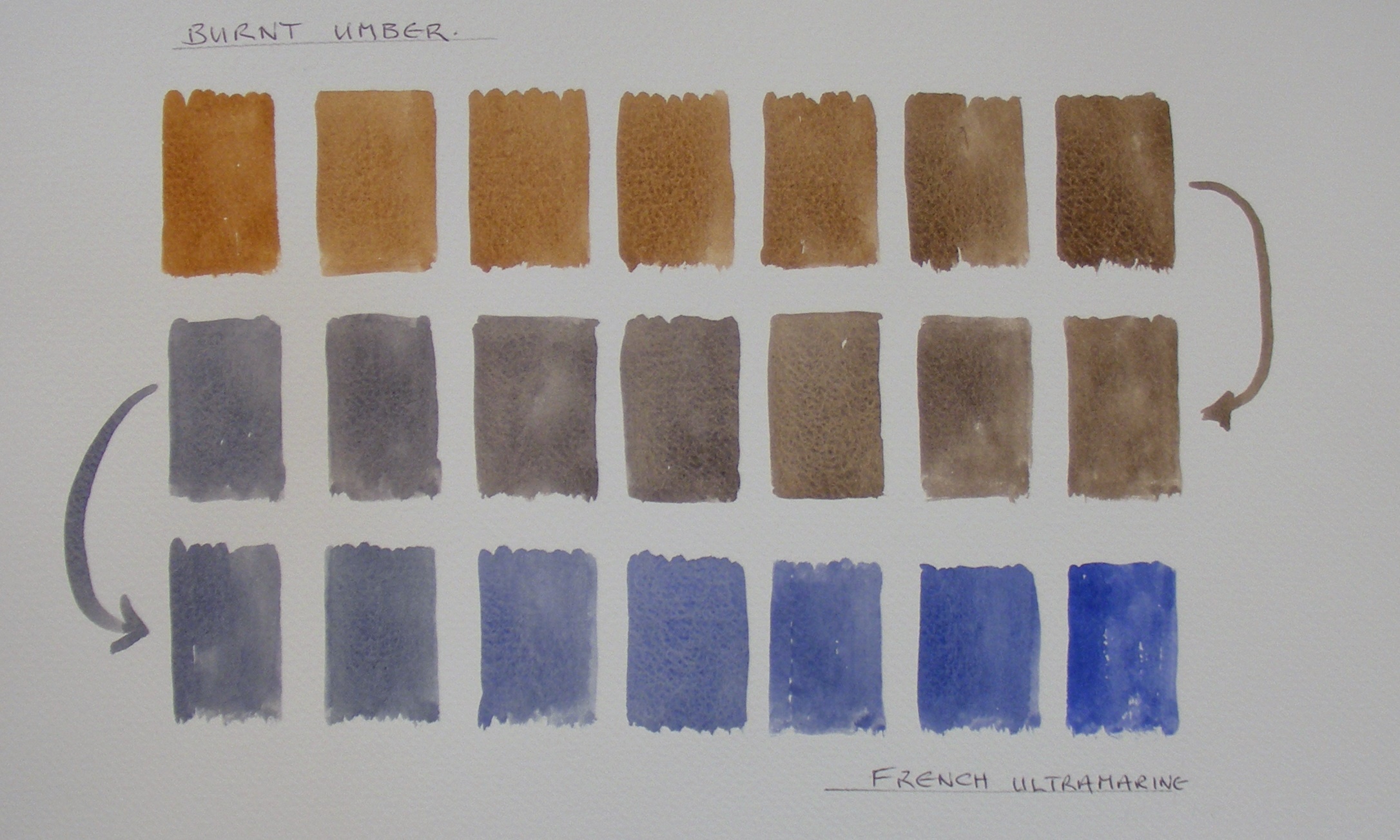
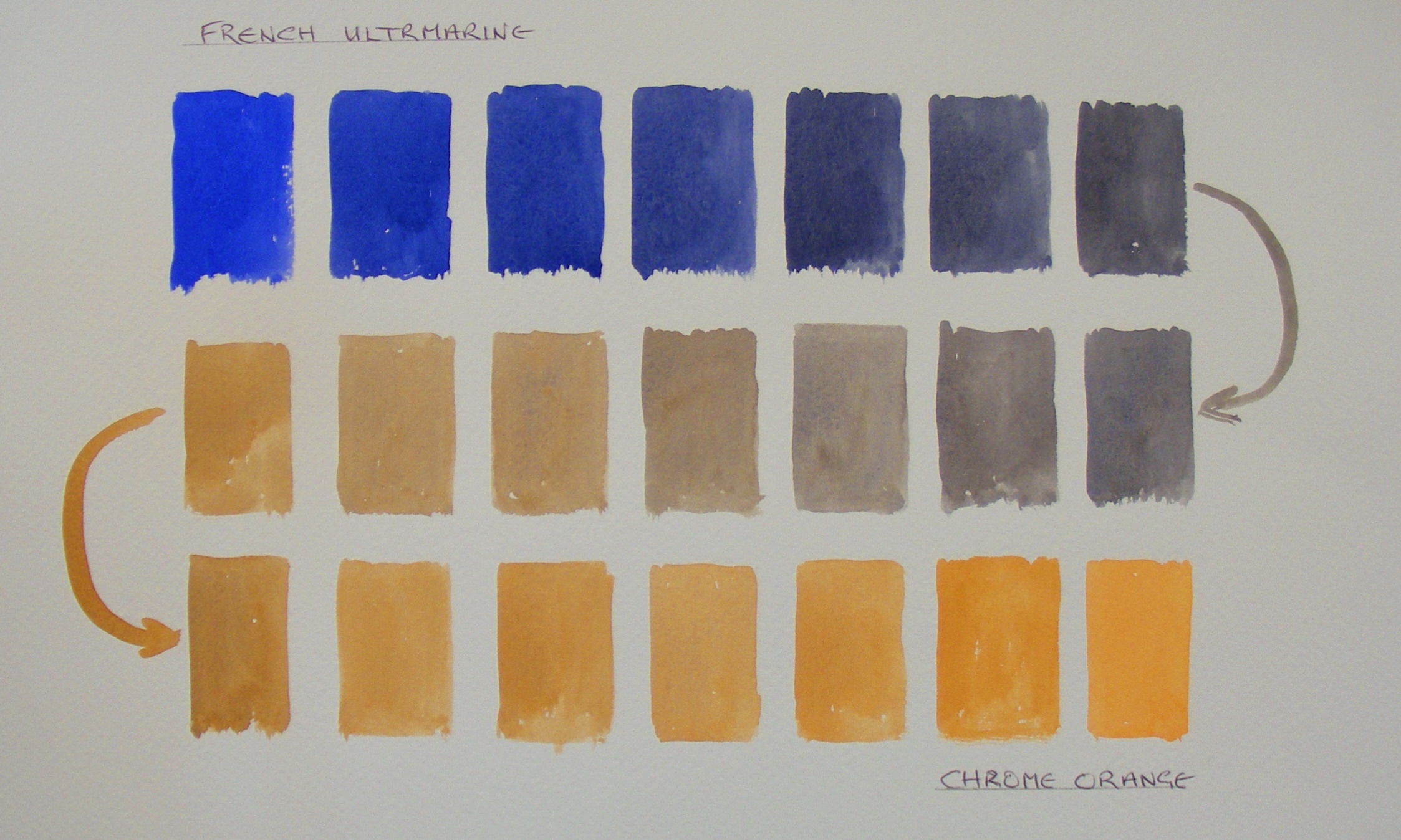
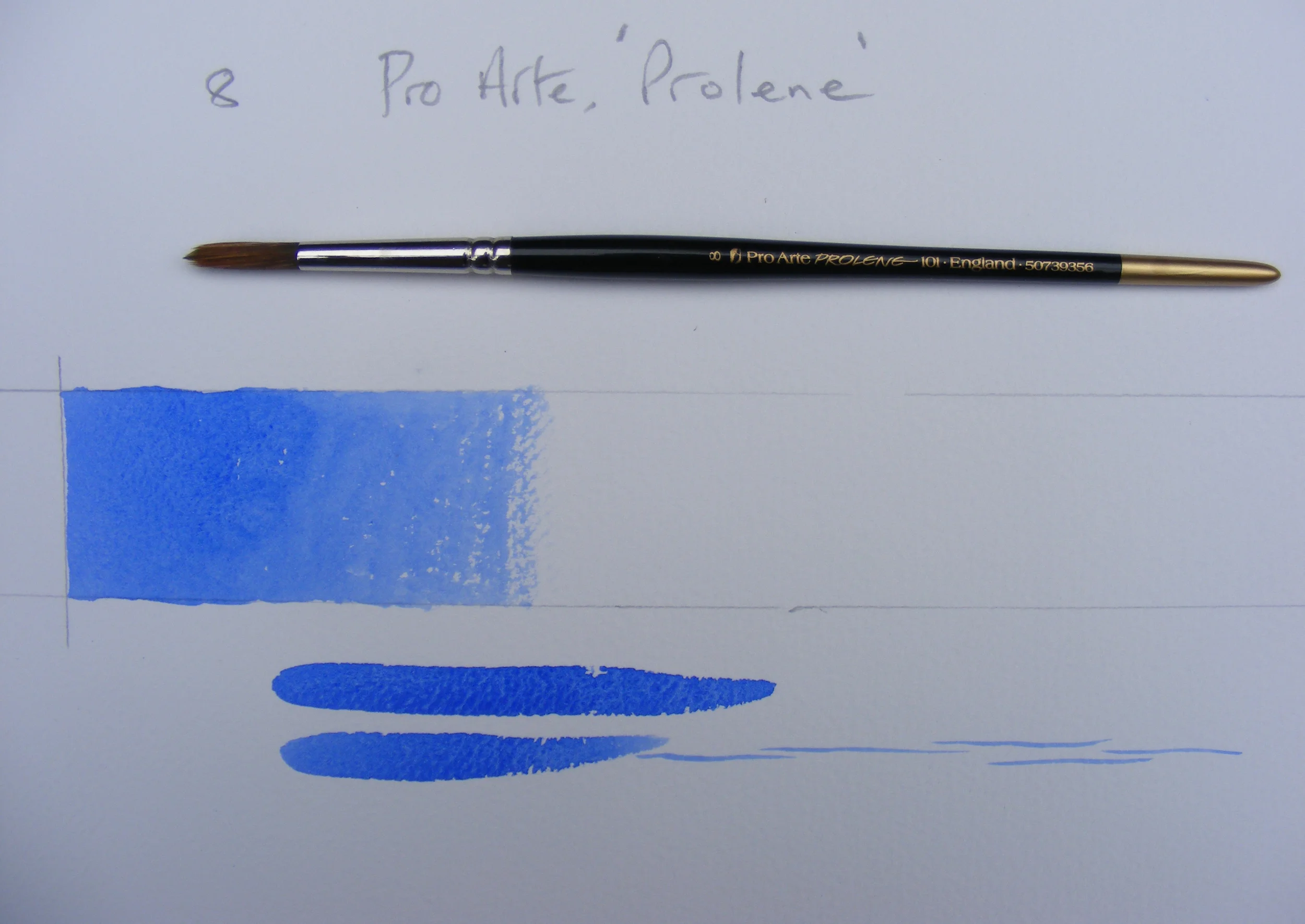
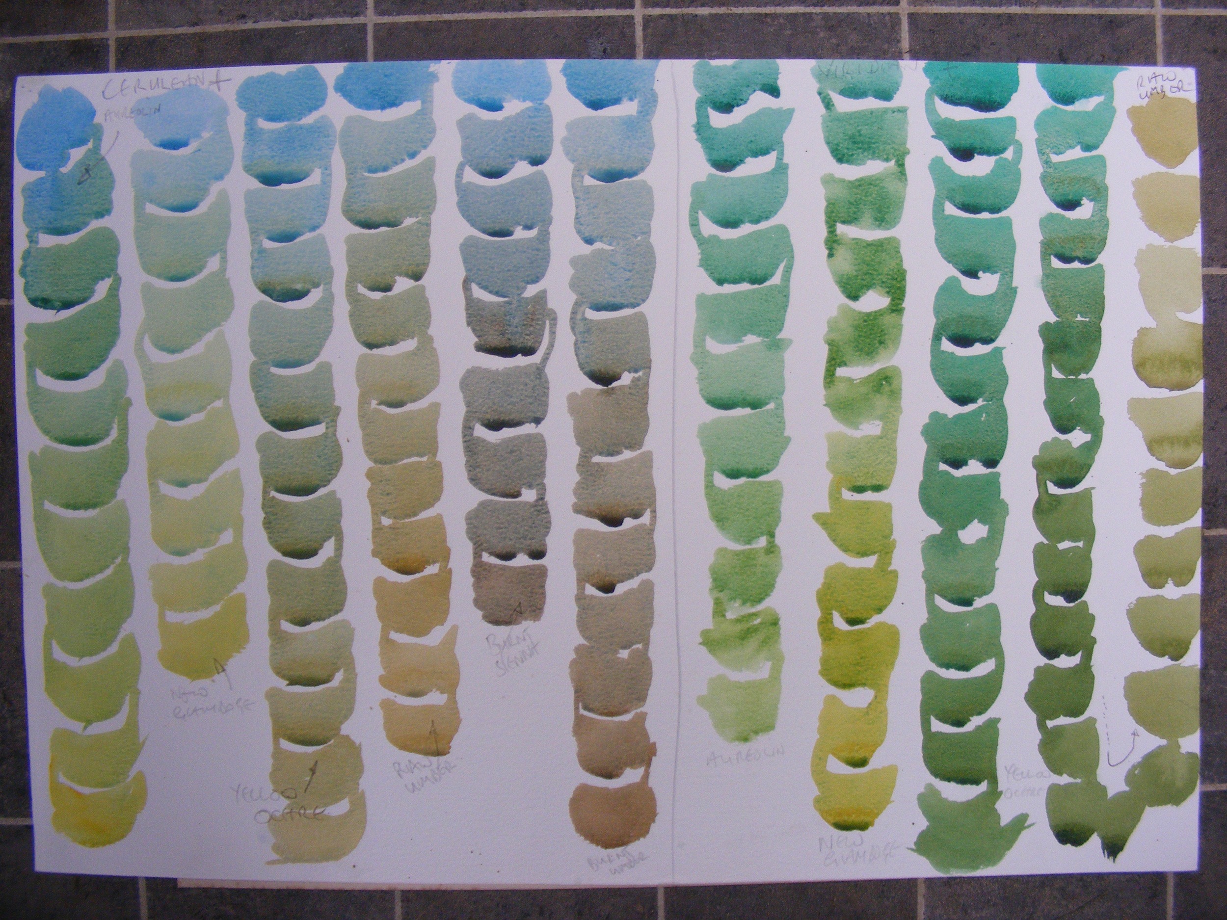
The test for this is very simple; all you need do is paint a strip of black acrylic paint on your paper and then paint the test colour over it, at right angles. If the paint is transparent it will hardly change the look of the black at all, whereas paints that are opaque leave a coloured chalky residue on top of the black which can be seen quite clearly (look at Cerulean in the blue set) 

Have a look back at lesson 3 and you will see another reason why it matters. Watercolours ‘work’ because the light travels through the paint and bounces off the paper support and back to the viewer, this is what gives watercolours their unique quality of luminosity. If the paint is applied so that it is almost opaque, like gauche, it will stop the light getting to and from the paper thereby ‘deadening’ the colour. I am definitely not saying don’t use opaque colours just be aware that when used with too little water they will soon make your painting dull and muddy (which is fine if you want the dull and muddy look).

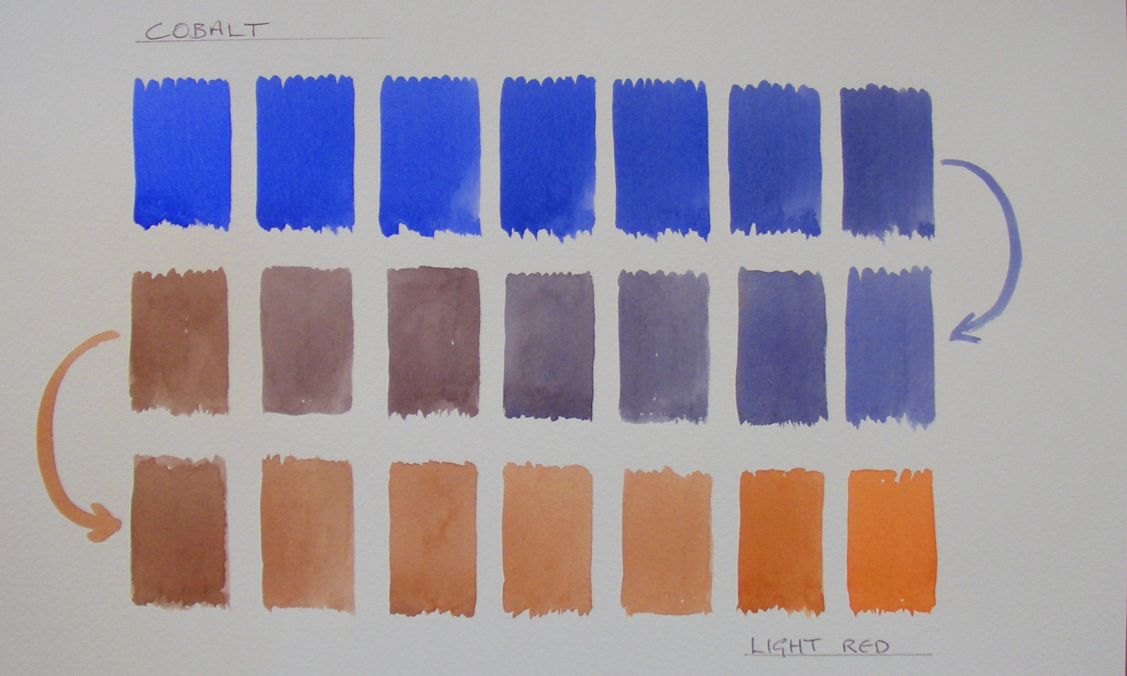
If we have a look at the blue set…

Transparency Test for Blues.JPG

Cerulean Blue is clearly the most opaque colour and although it is difficult to see on the image, if you do the test yourself, you will see that French Ultramarine also leaves a slightly  opaque layer over the black.

Transparency Test for Reds.JPG

With the red set, it is quite clear that Cadmium Red is by far the most opaque, so although it looks a very bright red straight from the tube it will soon ‘deaden’ any mix, if used with too little water.

Winsor Red and Scarlet Lake are moderately opaque and all the other reds are virtually completely transparent.

Transparency Test for Greens.JPG

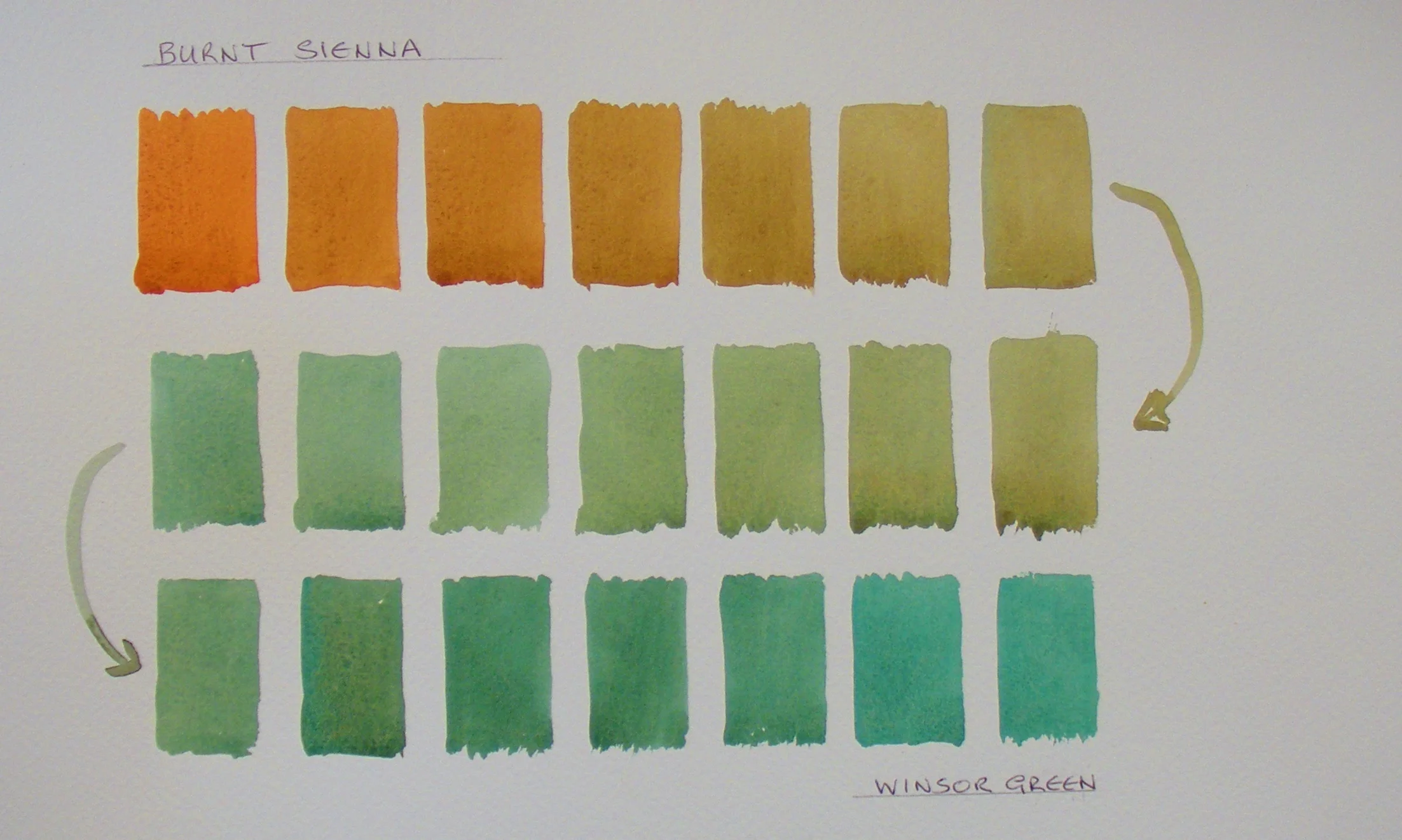
In the green set it is Cobalt Turquoise that stands out as the most opaque. It is a colour that I find very useful when painting around the coast of Cornwall but I am always sure to use it with plenty of water to make sure it does not look ‘dead’ and chalky.

Viridian is not quite as opaque as Cobalt Turquoise but it comes a close second and Winsor Emerald is moderately opaque and all the others are virtually transparent and that is probably why Sap Green looks so vibrant.

Transparency Test for Earth Colours.JPG

Although all these colours (or close equivalents) can be mixed from primaries, I find this group of tertiaries particularly useful for landscape painting; particularly when looking for a variety of greens. Subtly different greens and greys can be made by adding different blues to the tertiary colours, the variety of the resulting mixtures is enormous and once you learn to control these green mixes you will never be tempted to use Viridian straight from the tube again (or worse still Hookers Green).

By far the most opaque is Yellow Ochre followed by Gold Ochre and Raw Sienna. Yellow Ochre is however one of my most useful colours but it has to be used with plenty of water particularly in skies, otherwise instead of suggesting a warm evening light it slips into suggesting a sandstorm!

Burnt Umber Burnt Sienna and Raw Umber are moderately opaque, which is only to be expected as all these earth colours are formulated from ground up pigments. This is one of the reasons that pictures can soon become (literally) muddy looking if too little water is used when mixing with these colours.

Transparency Test for Yellows.JPG

With the yellow set, Cadmium Yellow Pale is the most opaque with Winsor Yellow Deep coming a close second. So although Cadmium Yellow Pale looks bright it can soon deaden when used in mixtures with too little water and for bright greens I would reach for New Gamboge instead; it looks very similar but being almost completely transparent it can be mixed without deadening the colour.

Naples Yellow is only moderately opaque but it is a colour I seldom use because it looks so ‘chalky’, being almost more like a white than a yellow and in case you haven’t noticed I never use Chinese White.

All the other yellows are virtually transparent and I use New Gamboge as my warm primary and Aureolin for my cool primary yellow. New Gamboge is a particularly powerful yellow and is very useful for strong green mixes. Aureolin is a very delicate colour but because it is completely transparent it can be very usefully employed for soft greens.

That just about wraps up this lesson on Transparency and Opacity. What I suggest you do, if you have any doubt about how a particular colour will behave on the paper, is to try it out on some scrap paper first.

The great challenge with watercolour, unlike oil, acrylic and pastel is that you only really get one crack at it. With the other mediums you can (more or less) wipe away or paint over a passage you are not happy with and modify the image; this just does not work with watercolour. Almost every mark you make will show in the final painting so it’s doubly important to be able to control and predict what will happen when the paint settles.

In lesson 9 we will have a look at how ‘powerful’ any particular colour is and I will show you an easy way of finding out for yourself before you end up chewing your elbows off in  frustration and wishing you had never just ‘added a dab’ of a particular colour.


Lesson 8 - Staining

If you are the kind of painter who is happy to throw coffee grounds, sand or acrylic glitter onto their watercolours and then stand back and pray for a happy accident then you can happily ignore this lesson. This lesson is specifically about the qualities that individual paints have and how these qualities can be explored, so that you can make more informed choices when actually using your paints. In short, this lesson should help you control the medium rather than relying on a more or less random outcome.

If you have a quick look back at lesson 3 you will see that when the paper is stained by the watercolour you are using, much less light is reflected back from the surface and the more it is stained the duller your colour will look. Luckily, there is a very easy way of finding out if your colour is a staining colour or not. You simply lay down a medium strength, smallish patch of the colour you want to test and then once it has dried you try and wash half of it away with clean water, dabbing with a tissue to mop up any paint that comes away. If it is a strongly staining colour you will find that even after quite a bit of washing and dabbing, you will be left with a clearly stained area of paper.  Obviously if you are comparing colours directly you should apply the test fairly by ‘washing and dabbing’ the same amount for each area of paint.

Here I have tested 6 useful blues that I have in my box and you will see that some stain heavily and some hardly at all.

Without doubt Winsor Blue stains most heavily followed by Antwerp and French Ultramarine. Cobalt and Indigo are only moderate strainers and Cerulean hardly stains at all.

So why does it matter whether the paint stains or not?  There are two quite different issues to consider. If you are planning on doing a low key painting with dark sombre colours, perhaps a nocturne, then it would make sense to use staining colours from the start because they would naturally give a darker look to the picture. If on the other hand you were planning to lift certain areas of colour to make them lighter or to try and get back to the ‘white’ paper then it would be a hopeless task if your paper has been heavily stained. Although in theory you can leave ‘left lights’ of unpainted paper I can tell you from experience that it is surprisingly easy to miss them when laying in a wash and you then end up trying to rescue things by washing away some areas of paint. If you have used heavily staining paints from the start the task becomes hopeless.

The same exploration can be made for any or all of your colours and I have done the same thing with the reds from my box.

Alizarin Crimson is the heaviest stainer, with, Winsor Red, Scarlet Lake and Cadmium Red not far behind. Brown Madder and Rose Madder Genuine hardly stain at all.

You might be interested to know that I tend to use a mixture of Cobalt Blue and Rose Madder Genuine for some cloud shadows, particularly in evening light, precisely because the grey/purples they form retain their luminosity as neither colour stains much and I need this quality of luminosity for my skies as it helps to generate a feeling of airiness and distance. If I substituted say Alizarin Crimson to make the purple the result would generate a very glowering broody cloud shadow (useful for tropical cyclones!)

It is only really by doing the stain test that you start to get into the subtlety of the colours. For instance although Scarlet Lake looks like a nice bright orange, straight from the tube it stains so heavily that it soon loses any freshness. Whereas Brown Madder, which looks quite dark from the tube, can make lovely ‘bright’ orangy-browns when used with a bit of water.

The greens are a very interesting group to test particularly as they are needed so much in landscape painting.

image 3 lesson 7.JPG

Viridian green stain the most without any doubt. Olive Green and Cobalt Turquoise are moderate strainers and Winsor Emerald, Winsor Green (surprisingly) and Sap Green hardly stains at all.

So if you are looking for dark forest greens try mixing earth colours with either Viridian or Winsor green which will give you rich dark colours, or you could mix your dark greens by mixing yellows with Indigo or Paynes Grey

Cobalt Turquoise and Winsor Emerald can be usefully mixed with yellow/earth colours to give a feeling of sunlight.

The set of warm tertiary colours are also interesting to look at too as they are often used in combinations with various blues when painting landscapes

Burnt Umber, Burnt Siena and Gold Ochre stain quite heavily, whereas Raw Umber and Raw Sienna  hardly stain at all, don’t ask me why, but it is certainly useful to know when painting.

Vandyke Brown, which is a good useful basic brown does not stain quite as much as you might expect, and can be used with blues to make greys, and reds to make rich warm browns.

I have included Yellow Ochre in this group because although it is a ‘yellow’ it is very much a tertiary yellow and fits well with the ‘earth’ colours. It is only a moderate stainer and I often use it with plenty of water in warm skies.

The Yellows are also an interesting set to examine because although several of them look quite similar when first out of the tube they behave quite differently.

Of the set it is definitely Cadmium Yellow Pale which stains the most heavily so although it is a ‘bright’ yellow it can make dull mixtures if not used carefully.

New Gamboge, Aureolin  and Winsor Yellow Deep stain only moderately with Winsor Yellow Deep  being the warmest of the three. And Winsor Yellow, and Naples Yellow hardly stain at all and so can be used where ‘light’ high-key colours are needed

If you have any other colours in your box which I have not mentioned it is easy enough to test for staining and it is something that can very usefully be done when you are in a curious mood on a wet Sunday afternoon (and it’s more interesting than painting the hall!) It’s well worth the effort because once you know how each colour stains (or not) you will find yourself reaching for the most appropriate colour. Remember, if you use a staining colour you need to know it’s going in the right place because even if you try your best to scrub it away there will always be a ‘ghost’ of the colour visible.

In the next lesson I am going to look at the qualities of Transparency and Opacity and how they influence the behaviour of the paint and how you can use this knowledge to control the overall ‘feel’ of the painting. 

Lesson 7 - Fifty Shades of Grey (or Green or Brown or…)

Sorry about the pun but I just couldn’t resist it. So, no bondage or bedroom games but instead an exploration of how to find and mix the colours you want rather than the ones you don’t.

If you imagine that the colour you are after is like the bull’s eye in a dart board, then my intension is to help you with your aim. It is frustrating to the point of extreme expletives to know precisely the colour you want only to find that the colours you chose to mix just never quite make it.

It would be useful at this point to have a quick look back at lesson 4 about the place of colours on the colour wheel because this is crucial to successful colour mixing.

When considering the almost infinite (never mind fifty) shades that might be referred to as grey it is important to understand that as grey sits dead centre on the colour wheel then any two colours that sit opposite each other, will at some point mix to a grey somewhere between the one colour and the other.

I want to stress that when considering colour mixing it is helpful to completely give up the idea that any two colours mixed together will make a third particular colour. The truth is that a huge range of colours can be mixed from any two other colours, and the further the colours are apart on the wheel the bigger the range there will be.

 Let’s have a look at what I mean; say we start with a slightly unsaturated orange like Burnt Sienna and add just a tiny amount of Cobalt blue to it, the result will be a very slightly different colour, that you might describe as a slightly duller or browner orange. If you then add a tiny bit more cobalt to that mix it will make an even browner combination. If you go on relentlessly adding cobalt then eventually the cobalt will completely overwhelm the orange and you will end up with just pure Cobalt.

 Here is my record of the journey from Burnt Sienna to Cobalt...

Set 1 - Burnt Sienna to Cobalt.JPG

And you can see quite clearly that there are some lovey greys in there, as well as a whole selection of interesting warm and cool browns. In short the simple two colour mix has yielded more than a dozen distinct colours.

If you change the mix to Light Red and Cobalt you get a similar but subtly different set of colours where the greys are very slightly purple and the browns are more subdued because of the additional red that is introduces as part of the Light Red paint.

Set 2 - Cobalt to Light Red.JPG

Once you get going you will realise quickly that a huge variety of grey and tertiary colours can be generated from mixing opposite or near opposite colours. In all seriousness I suggest you take a few hours (or possibly days) out to make your own ‘colour journeys’ and keep them just to remind yourself of the range of colours available to you.

Here are just a couple I have made to show you… 

Burnt Umber to French Ultramarine.

And French Ultramarine to Chrome Orange.

At this point I would like to say a little about the mixing of greens. To be absolutely honest, at one time I would do almost anything to avoid using the colour because I just could not get what I wanted by mixing and the colours supplied in the tubes were nothing like I needed. Having spent years tutoring in art societies I am aware that I was not alone. I have seen countless landscapes ruined by ‘the wrong greens’ even when the draughtsmanship and compositions were great.

I blame my primary school, where as a keen painter-to-be I was told quite definitely that Blue and Yellow made green and I was then promptly handed two tubs of poster paint, one a nice bright French Ultramarine Blue and the other a nice warm Yellow Ochre. I was reduced to tears because no matter how I mixed them I never got green. I know now what was going on, but back then – boy was I frustrated.

Here is the journey from Yellow Ochre to French Ultramarine  

And it is quite obvious that the mix generated some very interesting cool-almost-green greys, some nice cool greys and some interesting khakis but no real green to speak of. The reason for this (if you don’t already know) is that there is a fair amount of red in Yellow Ochre (hence its warmth) and a fair amount of red in the Ultramarine so overall the mix is red, yellow and blue which clearly generates some kind of grey in the middle of the journey.

Understanding the colour wheel allows for the problem to be resolved easily so that if the warm blue is replaced with a cool blue like Antwerp blue (which tends towards green) then the mixture with the ochre is very different and you get this;  

If however you wanted an even ‘clearer’ green you could use New Gamboge instead of Yellow Ochre and then you get this set of greens which are far clearer and brighter.

There are a huge variety of greens that can be mixed, for instance a lovely set of warm and cool, tertiary  greens and green/greys from a mixture of Raw Umber and Indigo 

Another set of interesting greens can be made by taking a really brilliant green like Winsor Green and modifying it with the addition of an earth colour like Burnt Sienna which quickly desaturated the green and edges it towards a whole range of lovey subdued greens that shade gradually into browns. Here is my record of the journey from Burnt Sienna to Winsor Green.

By now you will realise that the variety is almost endless, forget the idea of opening a tube of Hookers Green or Viridian and just using it straight from the tube. Take your time to explore the vast range of greens that can be mixed by either desaturating intense greens with earth colours or mixing various blues with various greens.

So Fifty shades of Grey or Green or Brown is a very conservative estimate.

So to recap, here are a few general guides to help your aim.

If you are looking for clear, clean, bright greens mix yellows and blues that already tend towards green or use unmodified intense greens straight from the tube. 

If you want subdued tertiary greens, mix warm yellows or earths with blues. The ‘greener’ the blue you use, the greener the mix.

OR…

Start with intense, highly saturated greens or green/blues and drag them kicking and screaming into the land of beautiful tertiaries by adding warm yellows or earth colours.

If you are looking for a large variety of neutral greys and tertiary greys, explore what happens when you mix colours opposite or nearly opposite each other on the colour wheel.

Good luck with your journey.

My next lesson will be about ‘testing’ paints to find out what exactly is in the tubes. Not their chemical composition (which is beyond me) but how they behave (or don’t) when mixed with other colours and how they affect the watercolour paper.


Lesson 6 - Planning the Journey

If you think of making a painting as being like a journey and the finished work as the destination, then clearly it makes sense to do some initial planning. And planning tends to work best before setting off, not after you find yourself on the wrong train heading in the wrong direction.

I have led countless workshops at Art Societies and the big mistake that most beginners make is that they are in too much of a hurry, they want to get-on-with-the-painting and they want to get it finished. The problem with this approach is that very often the end result is a catalogue of regrets. ‘I wish I’d used a different green for those trees’. ‘I wish I’d moved that boat an inch or two to the left’. ‘I wish I’d used a different blue for the sky’. In short ‘I wish I’d painted a different picture’.

With acrylics, oil and pastel you might be able to paint over or scrape back and make the changes you want but watercolour is an extremely demanding medium and generally there is no going back once you have laid down the paint, you can make areas darker in tone but rarely can you get back to a crisp light, especially if the colour you want to remove is one that stains the paper. What usually happens is that in the attempt to correct the tones, you usually just make the painting more and more ‘muddy’.

The solution, or at least a good part of it, is to breakdown the job of making the painting into smaller and more manageable chunks.

At its most basic level a watercolour is a collection of coloured patches made on paper, so the obvious thee big questions that need answering are:

1      What shape do I want the patches to be?

2      How do I want to arrange the patches?

3      What colours do I want to use in the painting?

The good news is that these three questions can be answered before setting out to make the painting.

Question 1 has another question hidden within it, which is ‘what shape or format do I want the paper itself to be?’ You don’t have to use the shape of the paper on the pad; you can change the shape by simply cropping out the area you want to work on.

The reason it’s helpful to think of the painting in this way is because you can explore several different options before committing yourself to the actual painting.

Begin by making at least half a dozen small thumb-nail sketches just a few inches across using a soft (4B) pencil so that you can explore the tonal values of each patch. Work quickly without paying too much attention to the actual drawing, I am not suggesting you make 6 miniatures, just 6 rough outs.  

Use different formats to see which works best for what you have in mind and try different compositions or layouts.

For example suppose you were exploring a simple marine painting, with just a few simple elements; a sailing boat, some land/cliffs in the background, perhaps a figure or two in the foreground that kind of thing, you might end up with something like this:

six quick sketches

In this set I like A least, it looks very boring with very little to recommend it. I like D with its high sky and the long format of E appeals. I quite like the addition of the quayside with its interesting structure in the foreground of F too.  There is no right answer and if you don’t really like any of your thumbnails you have made then keep exploring until you find/invent a composition that excites you. It is a certainty that if you don’t like the tiny image then the full sized painting will be a disappointment too.

Exploring Colour

You can make choices about the colours you want to use well before doing any kind of final painting. Just make up several small colour roughs from 4 or 5 tubes of paint. They need be no bigger than a few inches across. Be careful to use the same kind of proportions of colour as you would use in the final painting, so at this point it would be good to know which layout you want to use, so that you have a good idea of the proportions of each colour you’ll need.

If you like things neat and tidy then by all means make up some formal swatches or you can just bung the colours down roughly as they would be in the finished painting. The whole point of this is to look for colours that you like and that work well together. The beauty of exploring colour in this way is you can concentrate on the colours themselves without being distracted by any other consideration. There is no real drawing as such to be done.  All you have to ask yourself is ‘do I like these colours in these proportions?’ If your memory for colour mixtures is not well developed then by all means write things down to keep a record. 

The simple rule is that if you don’t like the colours you’ve chosen for your colour roughs then you are not going to like them in your painting either, so don’t use them! Keep exploring until you have found a set of colours you are happy with.

four colour compositions

Each of the small images have quite a different mood, which is set almost entirely by the colours. 

In the best of all possible worlds you will end up with a collection of colours that you really like and a composition what you are happy with. With a firm idea of the colours you want to use and the composition you like, you can get on with your painting with a really clear sense of direction and a much improved likelihood that you will get to the destination you want.

The end result will seldom be exactly what you planned but you are at a great advantage starting with a clear sense of colour and composition. It takes more time to paint when you plan but I can tell you from experience that it is time well spent. Good Luck. 

Lesson 5 - Getting Painting and Organising the Process

Ok, if you’ve read the previous lessons you’ll know quite a bit about palettes, brushes, paper and paint, so the significant question now is how do you actually ‘do’ a watercolour.

Before kicking off its worth considering the difference between watercolour and other mediums and the important thing is what it says on the tin - watercolour. When you work with oils or acrylics or pastels you can be pretty sure that when you place a splodge of colour on the surface it will stay where it is and if the colour underneath is dry the new splodge will cover it completely (unless the medium has been thinned of course).

None of the above is true of watercolour, it is, to say the least, runny stuff and likely to run everywhere and used in anything less than industrial strength it is always at least partially transparent.

The fundamental key to working successfully with watercolour is to embrace these unique qualities and work with them and not against them. Exactly what I mean by this will become clearer as we go on.

There are an infinite number of ways of applying the paint to the paper but here I am going to outline one way that is fraught with significant problems (which most beginners intuitively gravitate towards) and another that seems to me to work well for nearly all subjects and solves many of these difficulties.

At this point I’d like to apologise to any reader who is reasonably experienced as I don’t want to be accused of ‘teaching my grandmother to suck eggs’ but here, my comments are directed solely to relatively inexperienced watercolourists who are just starting out, ‘beginners’ is the word I’ll use.

From the many workshops I have run around the South West (UK) it seems clear to me that most beginners think about their paintings and therefore, work on their paintings, as if they were a little like a patchwork quilt, that is to say they will paint in discreet patches that abut each other. When painting a landscape they will invariably paint the sky from the top of the paper down to the top of the hills and stop. Then they will try and paint the hills up to the bottom of the sky and stop. At this point alarm bells will start to ring because the sky is likely still wet, so they will leave a thin white line of dry paper between the sky and the hills so the colours don’t run into each other.

And so the painting progresses with more or less successful attempts to keep the warring puddles of colour apart and when the puddles meet, the colours bleed into each other and tissues are frantically applied to soak up the mess and more paint is applied to repair the damage done by the tissue and… well let’s just say that an hour in, half the class are into full-blown panic attacks, tearing at their hair in frustration and insisting that watercolours are simply too difficult to use.

The end results will often be landscapes laced liberally with white worms of left over borders or black worms of overlapped edges or German sausage worms of dark and light borders where the attempt to meet up has only partially worked or even more problematic double worms where the painter has painstakingly filled in the white space and overlapped both sides of the gap at once.

 Nevertheless, this way of painting by ‘piecing together colours’ seems so intuitively seductive and right that is has been taught by some well-respected teachers going back decades into the past. I quote from the book ‘Water Colour Painting’ by Alfred W. Rich (The New Art Library, page 42)

‘When one mass of colour comes in touch with another of different tone, so that  there is a danger of them running into one another , the best plan is to allow a thin line of dry paper to remain between them until both are dry an fill in the intervening space with either colour’

This concise bit of advice is in my opinion exactly how NOT to paint in watercolour.

By now I imagine you’re thinking ‘OK …. if you don’t paint in ‘patch-work’ how do you paint ‘

The answer lies in the way you think about your painting. Specifically I suggest that you think about your painting in layers not in discreet patches. Think of the painting as being made up of several layers of transparent coloured cellophane with each new layer adding to the one below.  So you paint your first layer with all the ‘light’ tones you will need, all in one wash over all the paper. Then you paint your mid-tones and then finally your darkest darks –Job done – no worms.

This method takes a bit of thought and organisation but solves all the edge problems in one go. And because the painting is made in layers the colours will be more unified and harmonious.

For instance, say you are painting an estuary scene; first of all you rough out what is going where with a soft (4B) pencil and then mix up all the colours you will need for the sky, the light passages in the water, the light reflected from the mud, in short anything that is going to be of a light colour. You will probably need maybe half a dozen different colours so mix them all as you will not have time to remix once you get going. Having made a copious supply of everything you need, you wash all the colours onto your (slightly sloping) paper from top to bottom totally ignoring the pencil lines but changing the colours as and where needed. This can be done (more or less) wet-in-wet over the whole sheet of paper. So layer1 done, relax and go and have a coffee.

With a bit of luck when it is all dried (use a hair dryer if you are in a hurry, or leave it out in the sun if you are outside) you will see an area of paper that looks sky-ish and some areas that look like water and the dry land will justbe a ghostly suggestion of pencil work underneath this layer.

Your second layer will be all your mid-tones, so mix plenty of paint for the colours you need and this time apply the wash over everything that is going to be mid-toned cutting round any light tones that need to be left untouched. You may need to add other mid tone passages to define some other details but essentially all the mid tones are thought of as one main mass.

Once this layer is dry; add your darkest marks, maybe shadow shapes and some small details and that’s it.

It is worth saying here that once the watercolour is completely dry the 4B pencil can be lifted out with a soft putty rubber. This is especially useful in light areas like the sky but any pencil lines that are useful and add to the image can of course be left where they are.

You should see clearly that as the hill is painted over the sky there are no messy edges and this should be true for the rest of the painting too, with all the edges clean and uncomplicated.

‘A picture is worth a thousand words’

So, here are 2 very simple, invented traditional estuary scenes (10X 7 ½ inches, a tad smaller than A4); a beginners ‘patch work’ painting with some ofthe problems that usually crop up and a layered painting (layer by layer) to show how these problems can be avoided.

Use a soft pencil to sketch out the position of the colours

Use a soft pencil to sketch out the position of the colours

First of all apply the light tones... everywhere! 

First of all apply the light tones... everywhere! 

Next up come the mid tones

Next up come the mid tones

Then come the next tones in your palette 

Then come the next tones in your palette 

Finally, add the darkest details there are

Finally, add the darkest details there are

The last step is to remove the pencil lines. Leaving a few helps delineate the different areas 

The last step is to remove the pencil lines. Leaving a few helps delineate the different areas 

Ok, I did this in a hurry, but it demonstrates the problem with trying to produce an image with patchworks of colour. It just doesn't work! 

Ok, I did this in a hurry, but it demonstrates the problem with trying to produce an image with patchworks of colour. It just doesn't work! 

I hope you will be able to see clearly just how different the two pictures look.  In the layered painting the colours harmonise together partly because the paint is transparent in some areas and because the paint is washed on over a large area in the first layer, subtle colour variegation from wet-in-wet painting can be seen. And there is a convincing sense of atmospheric perspective as the tones lighten towards the distance.

In the patch-work picture, the hills and clouds look very blocked in and the colours seem to jump about and not relate well to each other. This is because each patch has been painted separately. Notice also the dark lines on the top of the hills on the left and right which destroy the sense of distance and draw the eye too much and all the white lines everywhere which cut up the surface. In short the picture is clearly a collection of coloured patches which do not quite bond together into a cohesive convincing scene.

When I have taught this method at workshops, I usually do a quick demo first to show exactly how the layers are laid one over another and only then ask the students to try it out for themselves. Without fail at least a third of the class will still stop their skies at the top of the hills and carry on with their patchwork approach. This is partly sheer force of habit but often they will explain that because they know the sky ends at the top of the hills they find it impossible to continue with the wash.

I am aware that it seems counterintuitive to paint all the light tones over all the paper first BUT if you don’t, you will end up working very hard to stop the paint patches running into each other and your painting will end up being more a record of this struggle than anything else. So give it a try and see how you get on.

Have a look at some of the originals of creeks and estuaries that I have painted around Devon in particular, (Low tide, Bowcombe Creek and Afternoon at Mill Bay are both good examples) and you will see how the tones are built up one on top of the other with the last dark marks laid on at the end, with no unintentional white dividing lines anywhere to be seen!

Lesson 6 will be more about how to use watercolour and take advantage of its particular qualities and how to avoid some of the holes that a lot of beginners fall into. Cheers for now.   

Some encouragement for 2016 and a word of warning

My weekly life drawing sessions start again for the New Year soon and I have a real sense of anticipation about getting back to some serious and enjoyable drawing after doing nothing much over the Christmas holidays. This got me thinking about the act of creating and some of the risks that this entails. So, I’m going spend a bit of time making sure that you can spot these and then carry on creating.

Read more

Lesson 2 - Watercolour brush reviews and why you can’t tell a brush by looking at its handle

Most artists that paint take at least a cursory interest the brushes that they use. This is because to a certain extent the brush will dictate the kind of marks that you can make, in the same way that say a biro or an old fashioned dip pen have their own characteristic kinds of marks. Also, it will be your point of contact with the paper and it needs to feel right and do its job well.

There are some famous and notable exceptions though. Jackson Pollock, for part of his career, dripped, drizzled and poured car paint onto his canvases and clearly took a delight in abandoning his brushes altogether and more recently the German abstract artist Gerhard Richter found a whole new vocabulary of marks when he invented a gizmo that was something between a squeegee-mop and a yard long steel rule which he used to spread his paint with. However, I think it’s worth considering in detail what is needed from a watercolour brush, before leaping to the conclusion that you might be better off without one!

Watercolour painting has a long tradition in Britain and makers and manufacturers have tried for years to come up with perfect brushes. Generally the brushes are round, rather than the flat brushes used by oil-painters and they are constructed so that the hairs at the tip come to a sharp point. This is so that it is possible to paint smaller details without changing your brush, which saves time and a lot of faffing. The best brushes are constructed so that they can lift and carry a lot of paint from the palette to the paper which obviously means you can do more painting and cover a greater area before you have to collect more paint so you can spend more time painting and less time fetching and carrying.

Manufacturers are in the business of making money and spend a deal of time designing brushes that look great, with beautiful long painted handles, brass ferrules, and gold embossed script. However although this can be quite tantalising it has bugger all to do with how well the brush will work.

set of brushes

A very simple test that you can apply yourself is to give the brush the ‘Eveready Bunny’ test. Load it up with as much paint as it can carry (using a very wet mix) and make a long even wash of paint down the sloping paper between lines about an inch and a half wide until the brush runs dry. The distance you can cover before running out of paint is a very good measure of the carrying capacity of the brush, it is also worth seeing how thin you can paint a line with the point, this will tell you how well the brush will handle detail.

I have tested a handful of size 8 brushes that I’ve acquired over the years and I think there are some pretty useful lessons in the results.

Pro Arte Prolene

The Pro Arte ‘Prolene’ brush is very reasonably priced but you can see it covers only relatively little ground, it does however come to a good point.

Pro Arte – Renaissance Sable

The Pro Arte ‘Renaissance Sable’ cost heaps (about £27) but you can see clearly that it carries almost twice as much paint, however it’s a brand new brush and does not have a pin sharp tip.

connoisseur

The Pro Arte ‘connoisseur’ actually carries just as well as the pure sable but costs nowhere near as much and it comes to a very sharp point even though I’ve used it for quite a few months

Sceptre Gold

The Sceptre Gold 11-101 sable/ synthetic costs less than pure sable, is obviously a mix of synthetic and natural hairs and yet carries more paint and comes to a good point.

Un-named antique

The big surprise is that the unnamed brush that my wife found on eBay for a couple of quid beat all the others hands down. All I know about these brushes is that they were hand made in Ireland 30 odd years ago and the guy who sold them had a dozen or so in his attic. I don’t know what the hairs are, they could be sable or squirrel or something else. It was a very lucky find, but the point is that what matters is how well the brush works, not how lovely the handle is! 

So what can be learned from these tests? The most obvious conclusion is that natural hairs out-perform synthetic ones, although a brush with a mix of synthetic and Sable can be just as good and a lot less expensive. However if you only ever paint small paintings, say about A5 or smaller, using a synthetic brush wont cramp your style because you won’t need your brush to carry very much paint. If you make large paintings (A4 up to whole sheet) I would suggest that having natural or mixed hairs in the brush would make your painting a lot easier.

If you have a look at my originals on the website you will see that most of my work is quite large. I frequently cut my watercolour sheets into thirds, which gives a paper size 10 X 22 inches. Almost all of the painting is carried out with a size 8 brush, although I will pick up a 12 for big sloshy skies and I use a tiny brush which I keep just for my people and boats because I have more control than using the tip (however sharp) of a bigger brush.

Lesson 3 will be all about paper – also pretty damn important. Cheers for now.   


The Watercolour Teaching Project

I have been painting since my early twenties and have always used watercolour as my chosen medium. I chose watercolour for several reasons, the most important one being that I love it! I much prefer them to most oils or acrylics. I also knew that it was a very difficult medium to master – and I love challenges. It was also clear that watercolours are eminently portable and I needed something that travelled well.

I taught myself to paint (my degree was in Philosophy and Psychology!) and over the last 40 or so years have accumulated hundreds of books on watercolour and drawing techniques as well as the Artists that I’m interested in. My intension for this project is to reverse the flow, as it were, and try and condense the best of the knowledge I have gained from all of these books and my own years of experience and put it into this blog, where anybody who would like to learn about the art of watercolour painting can find everything they need.

Because I started from scratch, I know intimately the frustrations the complete beginner is likely to face. I hope this blog is helpful to them. However, because I have been using watercolours for so long and I have no intention of ‘dumbing down’, so it may well be that experienced painters might find it useful too.

I intend to structure the blog in a careful sequence, starting with the foundation basics and then building on them with discreet blocks of advice, information and workshop ideas. For decades I have demonstrated and run workshops in the South-West and abroad and countless times after seeing students work I have thought ‘If only you had been shown ‘X’ earlier on, you might not have been so disappointed with your painting’. This blog is about all those ‘X’s

I make no apology for being direct and having definite views on how things might be done. This is partly in response to some modern books which suggest you ‘just splash colour around and have lots of fun’ which is a bit like a guide book to a fabulous country that says ‘get off the plane and head for the first bar and then get back on the plane and leave’ with no other suggestions on places worth visiting, maps, history, or any other guidance. The point being that although you might have enjoyed yourself for a while, you will have missed an awful lot the country has to offer to the more adventurous traveller.

My next entry will be about what kind of paints to choose (or to add to what you already have), the advantages and disadvantages of using blocks of paint rather that tubes and why the kind of palette you mix your paints in has such a huge influence on the colours you end up with! See you then.      

Logs and Frogs

The year at Trewen has its own rhythms, which one way or another we choose to live by. All our heating and much of our cooking is fuelled by wood from our own land and all that wood has to be felled, logged, moved, split and stacked undercover, ideally two years before it is used. A warning to all those romantics who would love to live ‘off-grid’ – the wood might be free but the energy it takes to process it is definitely not.

This winter we have been working our way down an overgrown hedgerow of straggly sycamores and there is a rhythm to this too. We work one tree at a time so as not to be overwhelmed by the amount of work (for some reason trees seem to triple in size once they have been felled). We usually manage to log up two or three trees in a day and when things go well and we don’t get rained off. We end the day with a bonfire of brash and tea made on our Kelly kettle and some homemade cake, which goes a little way to ease our aching backs.

Once the frogs and frogspawn appear in the pond (often on my birthday) we know the year has really started to turn, the sap will be beginning to rise in the trees and it’s time to end felling for another year. ‘All’ that remains to be done, is somehow move all the wood down from the field, hire a log-splitter, split all the big logs and saw the wrist-sized branches to length and then stack them undercover in walls that will not fall over sideways by next winter. Easy! 

The Problem with Making a Start


It’s been an amazingly dry summer and I have been out painting more than any other year I can remember. I’ve met a whole lot of people too and a good number of those have bought my work before from galleries around South Devon where I lived for twenty odd years before moving to Cornwall.

‘Hey, are you the same Mark Gibbons as the Mark Gibbons on my wall in the hall’... ‘Yep, the very same one.’ Then we would get into the hows and whys of me moving to Cornwall and what they had been doing in the intervening years and the sun would shine and I’d make tea and all would be well.

I’ve had my spare chair and sketchbook with me every day but I have been surprised at how few people took up my offer of ‘Making a Start’. It would seem the move from ‘I would love to be able to paint’ to actually making any sort of mark is far more problematic than I had assumed. I think what people really mean is… ‘If by some stroke of luck I was visited by the painting fairy in the night and in the morning I was able to paint, then I’d be chuffed as a cat with two tails’. Trouble is, at some point you have to make a start with a mark of some sort.  

The culprit is of course ‘fear’ and its twin ‘shame’. Most people just would not take the risk of making a picture that was a lot less than perfect and have it be seen by others. The easy and obvious solution to this is to promise yourself absolute privacy but then you have the problem that you yourself will see the painting and you yourself will know it is not as good as you would like it to be. There is no way round this impasse except to accept that a lot of your first attempts will be disappointing and to just carry on making marks.

I would like to show you one of my early attempts at painting. I made this watercolour of the old paddle steamer that used to steam back and forwards across the Humber to Lincolnshire. I loved the old docks round Hull and spent many weekends as a student there exploring and trying to make some sort of a record.

The painting was made in 1971 the year before I graduated and I copied the picture from a black and white photo I developed myself in my dingy student kitchen. I have to say I’m fond of the picture for sentimental reasons but there is a lot that could be improved. The sky is completely lifeless and without any atmospheric perspective and there is no movement or colour in the river, you would be hard pushed to say where the sun is supposed to be, the smoke is a more or less solid flower of brown that blooms from the too red funnel. But it was a start and that is what matters.

I also would like to show you one of my Wet Sunday paintings. I had the beginnings of a draughtsman’s skills as I did a lot of technical drawing at school but I was, to put it mildly, crap with colour. So on wet Sundays, when I wasn’t walking round the docks, I would take out my paints and try and see what colours I could make and then I’d write down the ones I liked. The left side of picture is a collection of green greys made by adding different yellow and earth colours to Cerulean (still one of my favourites) and the right is Viridian toned down with different yellows. By just dealing with colour and not trying to make a proper painting it took all the complexities of drawing away and left me the totally enjoyable adventure of exploring what was in my paint tubes.

So, at the risk of overstating the paint (point!)… There are no tooth fairies or painting fairies…all you have to do is make a start and the rest will follow.  

Apples Apples Everywhere

A few weeks ago we picked the last of our apples and it was clear we had a problem, the problem being that we had simply had run out of storage space. We have a dozen or so trees in a young orchard with about half of them eaters and half cookers and each year they yield more than the year before and all my attempts at slatted shelving and stacked boxes in the pantry just didn’t hack it this year.

And, although I like apples and can manage two sliced up with my muesli each morning and a couple more during the day, it became clear that I would not be able to keep ahead of the rot! Sadly, even stored carefully, one by one they shrink and wrinkle and eventually rot away.  

Some friends who were visiting were astonished at my capacity to consume so many apples and suggested we bought a fruit drier to give my digestion a break. We did, it’s an Excalibur Food Dehydrator, a nine shelved unit about as big as a big microwave and so far it seems to be just what we needed all along.

Apples in the drier.jpg

Each shelf takes about six medium apples, cored and sliced and there are nine shelves, so that is about fifty apples. Once they are died they shrink down to one medium sized food bag and according to the book they should last at least a year if not two.

Coring and slicing fifty apples is a bit of a chore but not so bad once you get into the swing of things and when the drier is working it fills the house with a lovely fruity smell and I don’t feel under quite such pressure from the spirit of the orchard to eat my way through the crop before it rots, though I can foresee a time in a year or so when I will be looking at several bags of dried apples in the pantry and an orchard full of fresh ones and wondering about a plan B….. A cider press?      

Bees and Abundance

The bees this year have thrown away their text books and decided to give beekeepers a run for their honey. New queens (which are produced in May, June and July) should stay in their hives for a year or so before swarming. Swarming is just what beekeepers don’t want because basically about half the bees in the hive fill up on (your) honey and sod off with the queen to the far side of beyond, pretty much guaranteeing a poor honey crop and forcing the colony to start again from scratch. This year, probably because of the unusually long and warm summer the queens have been swarming out after just a month or so, which is, to say the least, very annoying.

Never the less, I’ve managed to take off about 70 pounds of honey which is a record for me. All this abundance reminds me of childhood harvest festivals and I mentioned to a beekeeping friend that as I am no longer religious I have no one to give thanks to for such a harvest. He answered with a wry smile that I’d missed the blinding obvious and that I should give my thanks to the Bees, which I hereby do!

This month’s words have been ‘too much’ or even ‘much too much too much’. It is great to go up into the garden and simply pick your breakfast/lunch/dinner and it seems a little churlish to complain but there are times when I want to go up there and holler at the top of my voice ‘For God’s sake ease up a bit’.

Having waited for months for signs of life we are now in a position where we are exhausted and can’t keep up with all the produce. Getting home after an evening out and having to go out again and crop the next kilo of raspberries (and hull them and get them on a tray in the freezer) before they go off gets to be just a teensy bit trying. Mind you, having seen the price of raspberries in the super markets I am tempted to invent a new category of worker who could be described as ‘fruit rich but cash poor.’     

That Eureka Moment

Putting to one side all the brilliant paintings that have been made with no reference to any kind of measurement at all (and there are many) and bearing in mind that many artists are quite happy to draw completely intuitively, there are certain kinds of drawings and paintings made when the artist wishes to make some kind of ‘accurate rendering’ of what is in front of them. This could be in a life drawing class or out painting a landscape or cityscape, doing a still life or a portrait, in fact drawing or painting almost anything ‘out there’ in a more or less accurate way.

Put simply the challenge here is to draw things the right shape and put them in the right place.  

In the past many different solutions have been sought, from the camera obscurer to the gridded viewfinder and squared paper. Even today, artists can be found in life drawing classes squinting past their pencils, held upright at arm’s length, trying to judge the various proportions of the model and making their measurements in ‘heads’.

My eureka moment came at three in the morning after I had spent several fruitless days trying to make some kind of gizmo that could scale up (or down) any ‘seen measurement’ into a ‘drawn measurement’ that could be used on the paper.  and hitting on the idea of using a Perspex ruler which can be held at a fixed distance from the eye with the help of a simple adjustable loop of string.

Here is how it works…

Imagine you are in a Life Drawing class with a standing model. Make a judgement on how tall you want the figure to be and let us suppose that on the particular paper you are using 18 inches would look just right. You place the loop of string around your neck and adjust its length so that when the string is taut and the ruler is upright, the end of the ruler is seen to be just at the top of the model’s head and the 9 is seen to be just below the model’s feet. Job done. Now every measurement you make of the model, with the ruler, is simply doubled when transferred to the paper because 18 is clearly 9 doubled. Once you’ve done this no more adjustment needs to be made for this particular drawing.

You don’t have to stick with these particular numbers; all you have to do is establish a simple and easy relationship between the ‘seen measurement’ and the ‘drawn measurement’. For example when I go out landscape painting I often use watercolour paper that is 22 inches wide, so where it is feasible, I will adjust the length of the string so the ‘seen distance’ between the extreme left and right hand side of the desired scene is 11 inches, so that every measurement I make will be scaled up by a factor of 2 on the paper

Having used this scaling ruler for a few months now I am aware that it is quite tricky to both adjust the string and hold the ruler in the right place at the same time, so it is helpful to move the clamping toggle and make the string as long as possible so that the ruler can be moved backwards and forwards without hindrance and once the right placement has been found it might take 3 or 4 attempts at fine tuning, until exactly the correct string length has been established.

Although I cannot guarantee that using this scaling ruler will produce brilliant pictures, it will allow you to get your basic shapes and positioning solid and accurate and you can consign to history all those poorly proportioned misshapen figures and misjudged wonky landscapes. Try it out and you will save yourself all those wasted hours correcting poor initial drawing.


Artist at Work

I live in a tiny hamlet near Launceston on a 10-acre smallholding where conversation is in short supply. My wife is away at work all day and all the kids have flown and although talking to the bees is therapeutic enough, for a while, eventually I get to crave more than their droning on and after a few days start to develop cabin fever.

One of the few real downsides for me of being a professional artist is the huge amount of time I have to spend alone. Most people have at least a few colleagues that they work with and although that has its own challenges at least it’s a social environment and we obviously all evolved to live in close proximity to others. So my sign, ‘Artist at Work, Conversations are Free’ (which I always put up when I’m out painting), is there so that I can enjoy some human contact while I work. I’ve done a fair bit of demonstrating at local art societies over the years, so I am more than happy to work and talk at the same time. Very often I have to wait a while for a watercolour wash to dry, so I make myself a cup of tea on my camping stove and with any luck can have a free conversation too.  

I’d say about a third of all the people who stop to look over my shoulder say something like ‘I wish I could paint’ or ‘wow, it must be lovely to sit here on the cliffs and be able to do that’ and then go on to tell me that they have always been rubbish at painting since Miss Terror in primary school told them their flowers weren’t any good and anyway they couldn’t draw a straight line even if they tried. 

My answer goes something like this… In the days when you could walk up the isle and peek past the curtain and actually talk to the pilot of your plane, you wouldn’t think of saying to them ‘hey I wish I could do that but when I tried it at primary school I was just useless’. The chances are that the pilot ran round the playground with their arm’s out ‘wishing they could fly’ but clearly realised some time later that something else has to happen before take-off. The point being that flying and painting have a lot in common; there are a lot of variables that you have to control, and you have to know how to control them and (maybe) even know where you are going. AND to do it well you need to do it a lot before you get any good at it. It’s no surprise that our early attempts at painting are frustrating but that is not a good reason just to give up.

 The only significant difference between artist and non-artists is that artists do it and ‘non-artists’ don’t.

It has bugger all to do with talent (I know plenty of very talented ‘non-artists' and quite a few non-talented artists). The key is in the doing, just like learning to ride a bike (or flying). The good news is that crashing a painting results in less loss of life, though I admit it can be a terrible blow to one’s pride.

The hard bit is letting go, opening a tiny sketchbook and making a start. If you fancy it, and you come across me on the coast, I always carry a spare chair and an extra mug for tea.