To make an informed judgement about which paper(s) to use, it is hugely helpful to know how watercolours work and what makes them so different from other mediums like gouache, acrylic and oils.
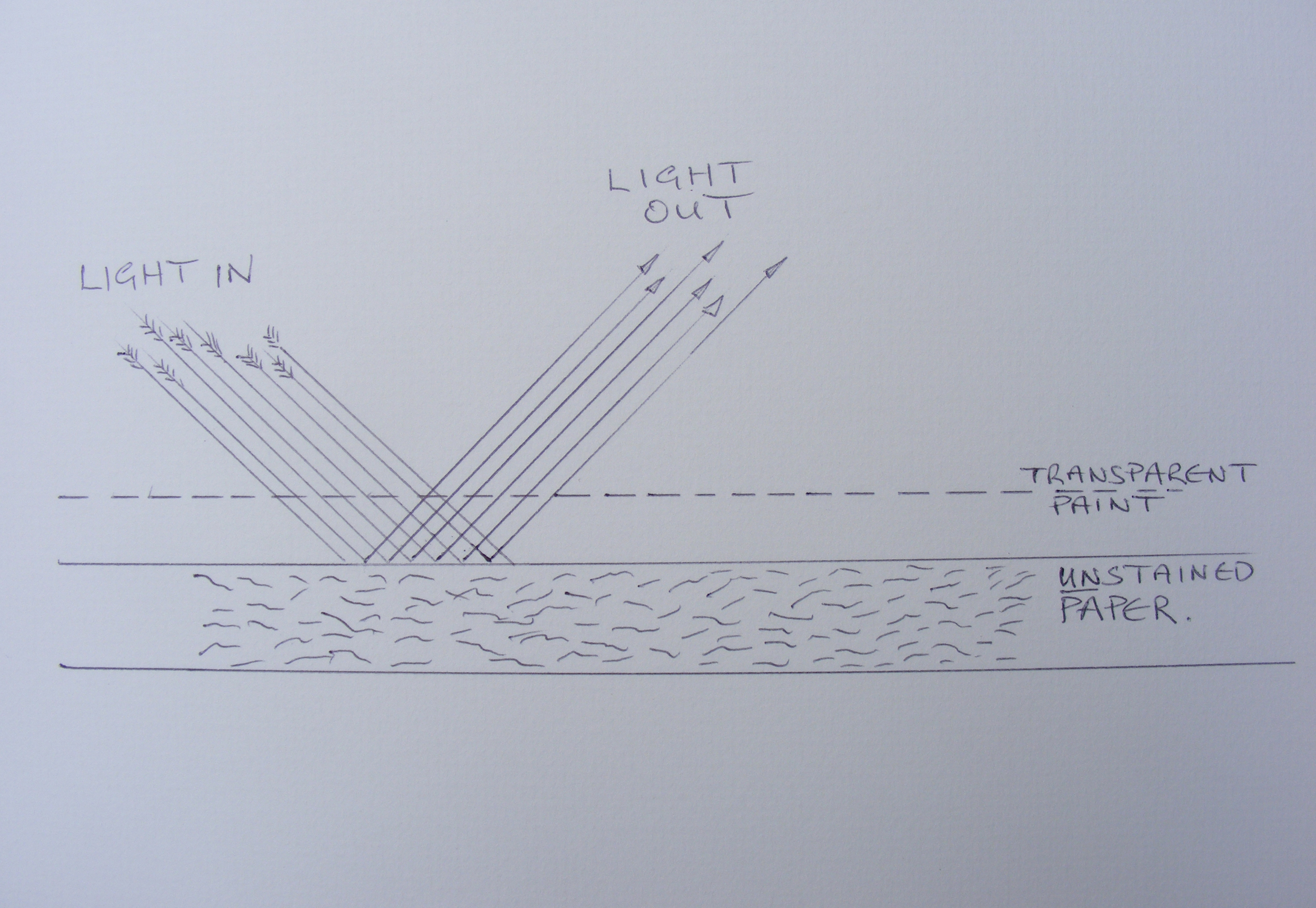
The critical difference is that watercolour is, for the most part, a transparent medium. Because of this, light can travel though the paint layer, to be reflected back from the paper surface and though the paint again, so that the viewer sees the colours illuminated from behind. The paint acts like a very thin sheet of coloured cellophane and it is this that makes some watercolours so luminous and bright.
There are two ways of well and truly screwing-up this process; one is to use too much opaque paint (more on this later), which stops the light from getting through the paint (in both direction)

And the other, which is just as important, is staining the paper, which will darken the surface and reduce the amount of light bouncing back, deadening the colours significantly. It is also worth noting that if the paper is easily stained you will have trouble ‘lifting out’ colours and lightening any particular area. This matters hugely as (if you didn’t know already) there is no white used in watercolours; any white that you see is generated from the white of the paper, so if you want to lighten a colour for any reason it is important to be able to wash some of the paint off the paper and you won’t be able to do this if the paper is badly stained

Paper manufacturers are well aware of how all this works so they put ‘sizing’ in and on the paper to reduce its ability to absorb wet paint and become stained and they try to keep the paper bright and white. However, the paper has to be at least a little absorbent to hold the paint, otherwise it would just slide off the surface, so a compromise is reached and it is the specific nature of this compromise that can be clearly seen when you examine just how absorbent each paper is.
If you believed everything you read in their advertising, all manufacturers would be producing fantastic papers and all you’d have to do is pay your money and get on with your painting.
There are a few other important considerations about the paper that are worth exploring too. It is important that when buying paper for using with watercolours, that you should avoid purchasing cartridge paper, even if it is a lot cheaper. You may be able to lay a light wash onto it without too much trouble but the moment you do any washing-out or touch the surface with a second wash, it just comes away in little rolls of mush.
Arguably the best papers are made with 100% cotton, which keeps the paper very stable and strong even when soaking wet, but it does make them relatively expensive. There are some perfectly acceptable alternatives which use a proportion of cotton along with other substitutes. It is important that the paper you choose should state that it is pH neutral, so that the paper does not deteriorate over time and become brittle and yellowed.
There is a straightforward way of testing how easily any paper stains and I’d suggest you carry out this test on your paper before committing yourself to buying any paper in quantity. Don’t be swayed by the sales hype and all of the manufacturer’s often misleading superlatives, find out for yourself.
The test is very simple; you apply a few square inches of paint to the paper, let it dry thoroughly and then try to wash away half of the swatch, by ‘scrubbing’ with clean water and an old brush and dabbing with a tissue. The harder it to remove the paint the more stained the paper has become and with some paper you will find it impossible to remove much of the paint at all.
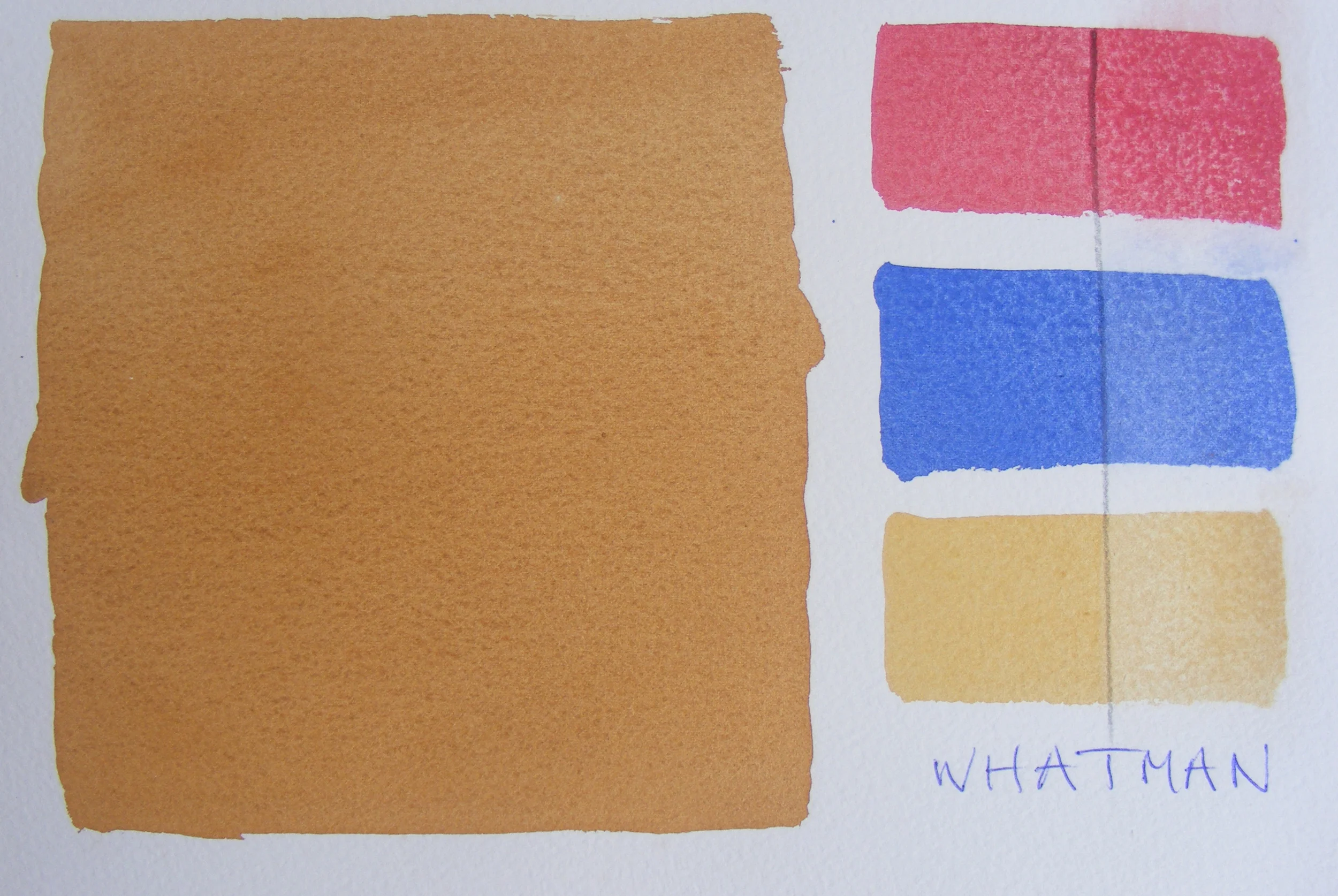
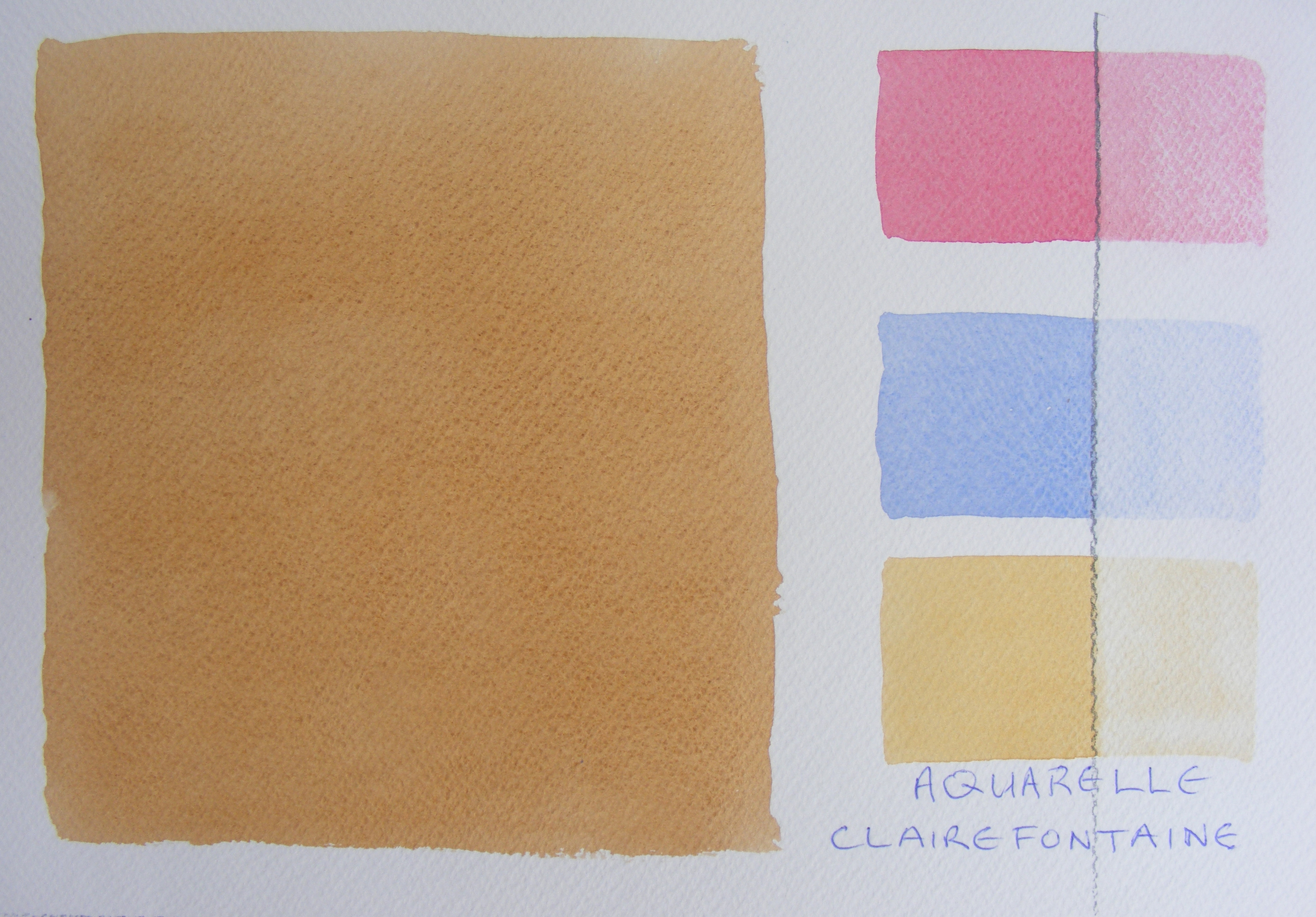
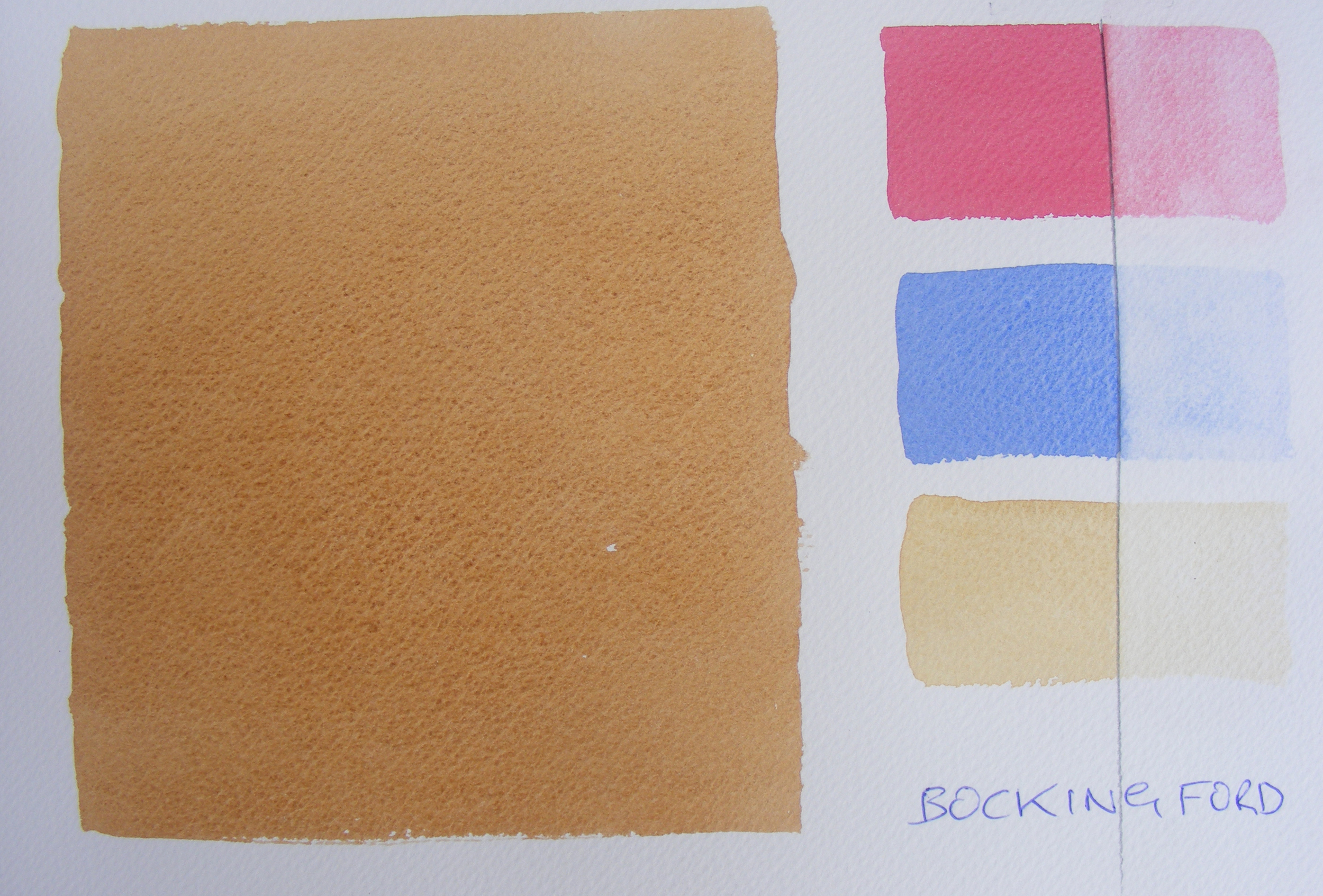
I have actually used three different colours for the test. Permanent Alizarin Crimson, which is known to be a very strong staining colour anyway and Yellow Ochre and Cobalt blue, both of which are reckoned to be non-staining. If you look carefully to the right hand side of the vertical pencil line, you can see clearly where I have tried to remove the colours. I have also made a large even wash of Burnt Umber to look at how evenly the paint takes to the paper.
I have tested 6 of the most commonly available papers though I am well aware that there are literally dozens of different ones available. If you have a different paper it can still be tested in the same way.
The fist paper I tested was Whatman. You can see that it stains so badly that the paint can hardly be removed at all, even with the blue and yellow, which on other papers, just lifts off. Also, there were areas of the paper that acted just like blotting paper and it was impossible to get an even wash. A sentence comes to mind with the words ‘touch’ and ‘barge pole’ in it.

Next was The Langton Prestige, which is a very popular reasonably priced paper, often sold in blocks and pads. It is manufactured by Daler-Rowney, is 100% cotton and is acid free which ticks most of the boxes. However, it stained almost as badly as the Whatman, although at least it did not behave like blotting paper and I could make a very nice even wash. I guess if you wanted a painting that was predominantly dark in tone like a nocturne and can work happily without the possibility of lifting any area of paint, you could use it. I have tried it but it did not suit my work, which is often quite ‘high key’ with few dark passages.

Arches is a French made paper and has a great reputation. It has been made in the same mill since 1492 and it still sells well, so they must be doing something right. It’s 100% cotton and acid free and holds up to a lot of working. It gave a very evenly textured wash and the colours lifted a lot more easily than the earlier papers. I have used this paper a fair bit in the past and think it is probably one of the best there is.

I have not used Aquarelle Clairefontaine paper myself but it seems to work well in the test and it is acid free and 100% cotton. I like the fact that it does not stain easily so that colours can be lifted and ‘lightened’ where needed. My only complaint, and it is a small one, is that the surface on both sides has a very regular, slightly ‘mechanical’ texture which I find intrusive.
Bockingford. This is the paper that I have settled on using over the years. It is not 100% cotton although it is acid free and it is of archival quality, which is what really matters. It has a very pleasing random texture on the painting side which is generated by the felting process, which I like, but above all it allows the paint to be lifted off easily which I find very useful. It is available in blocks and pads and is reasonably priced. I buy several years worth at once in a mill pack and then cut it to the sizes I need as I go along.
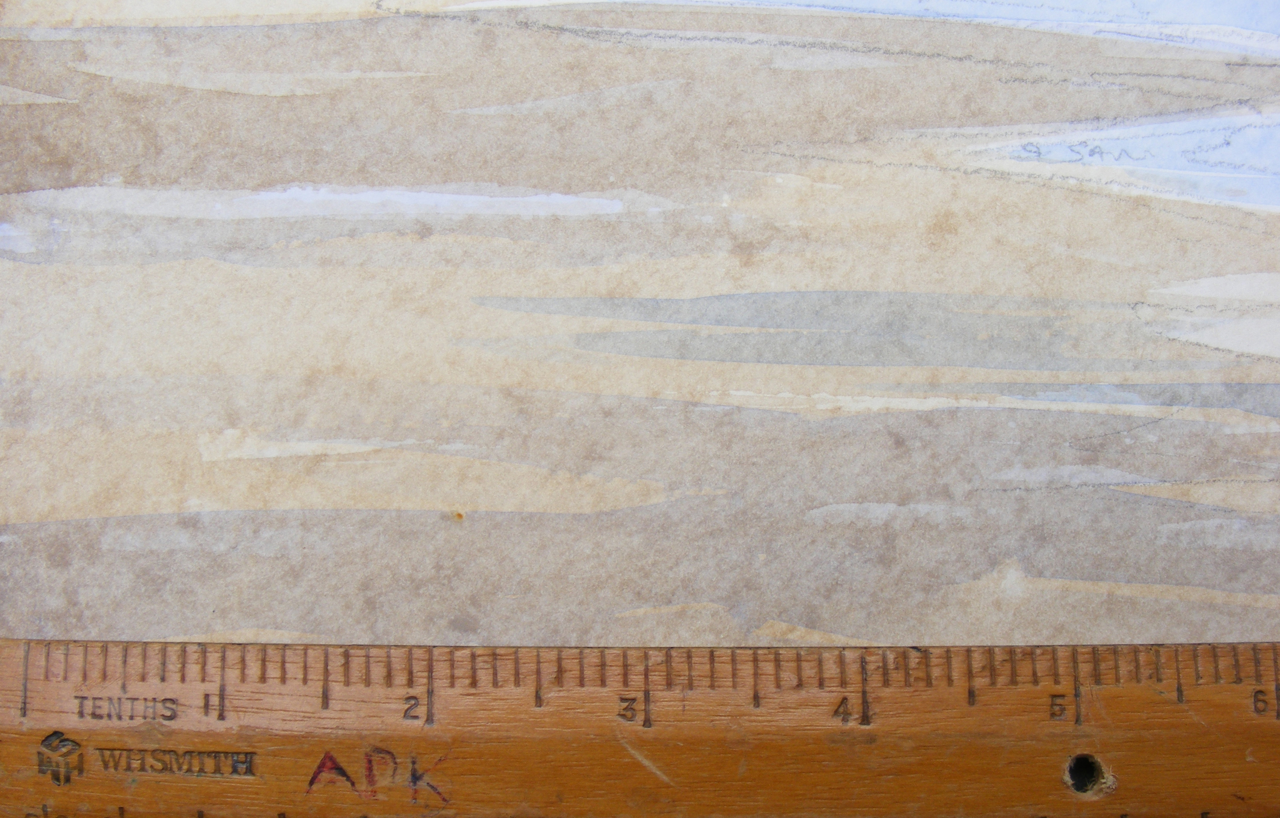
Cotman. This is the last paper I tested and the results were very interesting. It is a reasonably priced paper and is acid free. The colours can be lifted off more easily than with any other paper but unfortunately I think in solving one problem they have caused another.
When an area of paint is given a second layer, which happens often in watercolour, the paint underneath is too easily disturbed and causes the final wash to have a blotchy appearance! I trialled this paper, using it for a painting I did on the cliffs recently and if you have a look carefully at the area of beach and the sea (above the ruler which is there for scale), you can see this texture. The paper might actually work well in say a woodland scene or moorland landscape with a lot of dense texture but in area like flat sand and calm sea, the blotching is just too intrusive for me , so I won’t be using this paper again, at least not out on the cliffs.


It is clear from these tests that papers can perform very differently from each other in ways that will impact on your painting significantly. So if you are just starting with watercolour I’d advise you to try several different papers but only purchase them in small quantities. Once you have found one you like, then obviously you can buy at much as you want, knowing that it won’t end up in the compost bin!
The Texture of the surface
Papers come with different surface textures but to make the beginner’s life slightly more confusing they are referred to with different names depending on whether we are talking English, American or French.
Smooth paper, used where fine detail is needed, say in botanical studies, will be described as; Hot Pressed/ Smooth/ Satin/ Silk/ or HP
Then there is a paper which would have suited Goldie Locks which is not too smooth and not too rough, and it’s the surface of choice for me.
It is referred to as Cold Pressed, NOT (yes, NOT, as in ‘not’ hot pressed!), Fin or CP
And lastly Rough, which thankfully is referred to as rough which helps, or occasionally as Torchon which does not.
Paper Weights
Paper comes in different weights too, confusingly measured in two very different ways.
Either as lbs per ream (500 sheets of uncut paper) or grams per square metre
90lb (190gms/m2) is rather too thin to be useful for finished work as it buckles easily when wet and can fall apart if worked too much. However it is relatively cheap and good enough for quick sketches
140lb (300gms/m2) is very popular and not too expensive, it’s pretty tough and can be worked without fear of disintegrating. This is the weight I nearly always work with.
300lb (638gms/m2) is very thick and strong it can take an amazing amount of working and it does not buckle even when very wet. Its only disadvantage is that, rather like a blanket, it takes a long time to dry. It is often used by artists who use the rough texture to their advantage and then frame the picture without a mount in a box frame to show off the deckle edge.
Paper comes in other weights too but the information above will give a pretty good guide to what you are getting
To Stretch or Not to Stretch, that is the question
Traditionally, watercolour paper is stretched on a board before it is used so that it stays absolutely flat when it is painted. Basically you wet the paper thoroughly and then stick the edges down to the board with gummed brown paper. If you look on net there are several good videos showing how this is done.
I have found that carting stretched paper around (on its support board) when I go out to paint is a real nuisance and adds a lot of weight to my already pretty heavy kit. So I have come up with my own solution.
I Blue Tack the paper to my drawing board very firmly and paint with the board on a slight slope so the paint does not pool and cause too much cockling. Then, when I get home, I literally press the paper flat (like a flower) by dampening the back of the painting (just a little) with water sprayed from a plant mister and placing the paper between two sheets of plate glass with a weight on top. The painting can be removed the next day and it will be absolutely flat. Job done.
This may sound like a bit of a palaver but it frees you up from stretching every sheet of paper you paint on, which I can assure you will save a huge amount of time in the longer run.
So, now you know all this stuff you can look around an art store with a lot more confidence and make sense of all the labelling in the paper department.
Lesson 4 will be an introduction to colours, in particular, which colours you can buy to provide a useful core set to work with, so that armed with a couple of brushes and a pad of paper (and a palette) you can actually get down to some painting . Cheers for now.