Sorry about the pun but I just couldn’t resist it. So, no bondage or bedroom games but instead an exploration of how to find and mix the colours you want rather than the ones you don’t.
If you imagine that the colour you are after is like the bull’s eye in a dart board, then my intension is to help you with your aim. It is frustrating to the point of extreme expletives to know precisely the colour you want only to find that the colours you chose to mix just never quite make it.
It would be useful at this point to have a quick look back at lesson 4 about the place of colours on the colour wheel because this is crucial to successful colour mixing.
When considering the almost infinite (never mind fifty) shades that might be referred to as grey it is important to understand that as grey sits dead centre on the colour wheel then any two colours that sit opposite each other, will at some point mix to a grey somewhere between the one colour and the other.
I want to stress that when considering colour mixing it is helpful to completely give up the idea that any two colours mixed together will make a third particular colour. The truth is that a huge range of colours can be mixed from any two other colours, and the further the colours are apart on the wheel the bigger the range there will be.
Let’s have a look at what I mean; say we start with a slightly unsaturated orange like Burnt Sienna and add just a tiny amount of Cobalt blue to it, the result will be a very slightly different colour, that you might describe as a slightly duller or browner orange. If you then add a tiny bit more cobalt to that mix it will make an even browner combination. If you go on relentlessly adding cobalt then eventually the cobalt will completely overwhelm the orange and you will end up with just pure Cobalt.
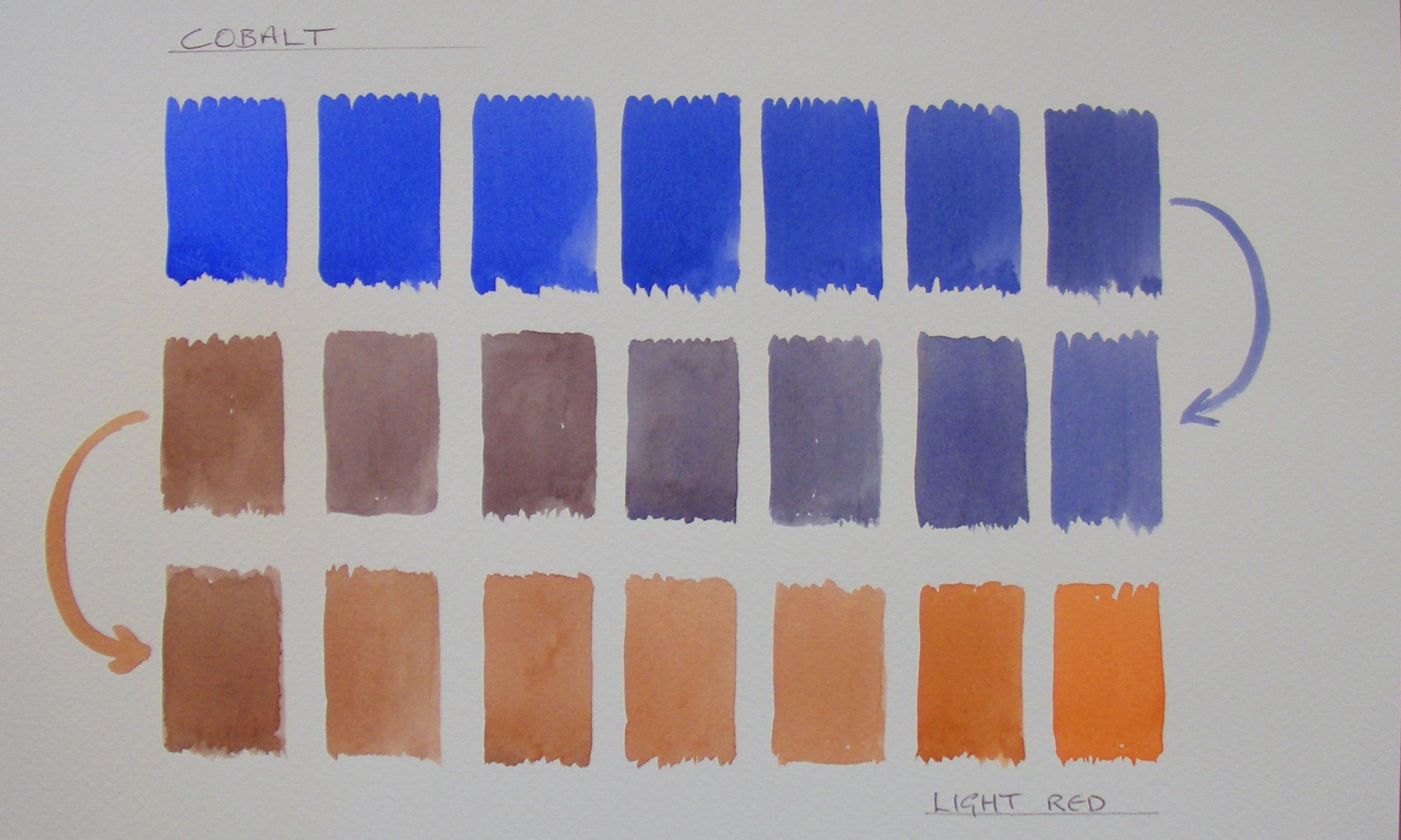
Here is my record of the journey from Burnt Sienna to Cobalt...

And you can see quite clearly that there are some lovey greys in there, as well as a whole selection of interesting warm and cool browns. In short the simple two colour mix has yielded more than a dozen distinct colours.
If you change the mix to Light Red and Cobalt you get a similar but subtly different set of colours where the greys are very slightly purple and the browns are more subdued because of the additional red that is introduces as part of the Light Red paint.
Once you get going you will realise quickly that a huge variety of grey and tertiary colours can be generated from mixing opposite or near opposite colours. In all seriousness I suggest you take a few hours (or possibly days) out to make your own ‘colour journeys’ and keep them just to remind yourself of the range of colours available to you.
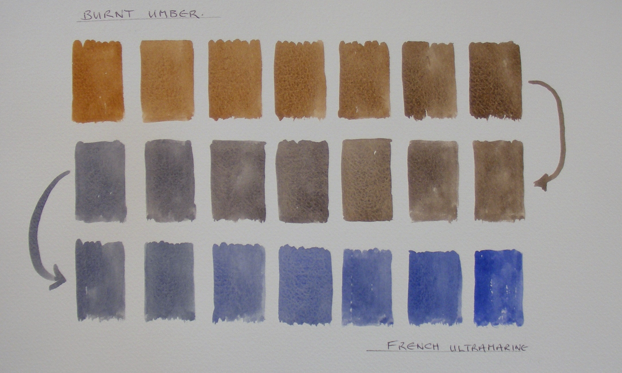
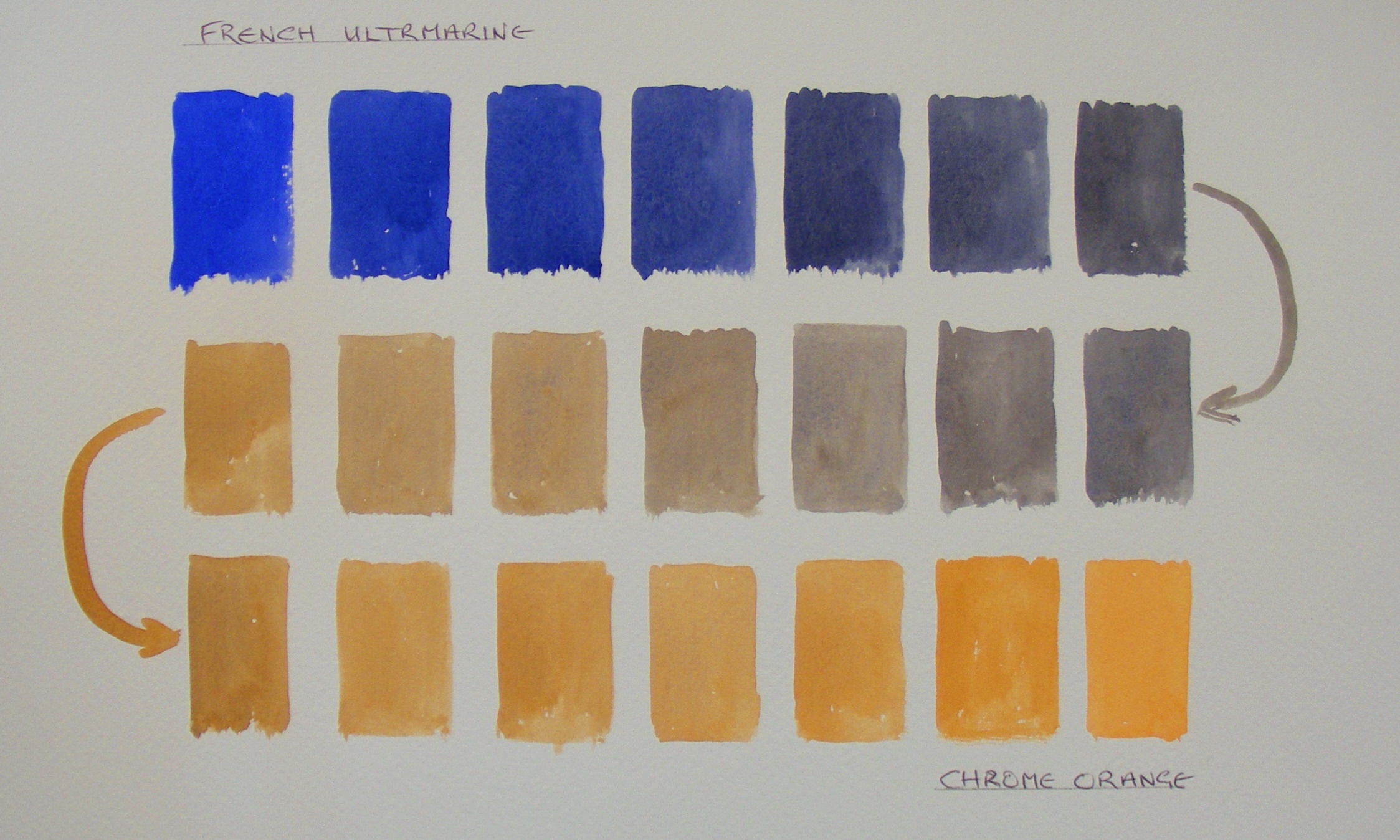
Here are just a couple I have made to show you…
Burnt Umber to French Ultramarine.
And French Ultramarine to Chrome Orange.
At this point I would like to say a little about the mixing of greens. To be absolutely honest, at one time I would do almost anything to avoid using the colour because I just could not get what I wanted by mixing and the colours supplied in the tubes were nothing like I needed. Having spent years tutoring in art societies I am aware that I was not alone. I have seen countless landscapes ruined by ‘the wrong greens’ even when the draughtsmanship and compositions were great.
I blame my primary school, where as a keen painter-to-be I was told quite definitely that Blue and Yellow made green and I was then promptly handed two tubs of poster paint, one a nice bright French Ultramarine Blue and the other a nice warm Yellow Ochre. I was reduced to tears because no matter how I mixed them I never got green. I know now what was going on, but back then – boy was I frustrated.
Here is the journey from Yellow Ochre to French Ultramarine

And it is quite obvious that the mix generated some very interesting cool-almost-green greys, some nice cool greys and some interesting khakis but no real green to speak of. The reason for this (if you don’t already know) is that there is a fair amount of red in Yellow Ochre (hence its warmth) and a fair amount of red in the Ultramarine so overall the mix is red, yellow and blue which clearly generates some kind of grey in the middle of the journey.
Understanding the colour wheel allows for the problem to be resolved easily so that if the warm blue is replaced with a cool blue like Antwerp blue (which tends towards green) then the mixture with the ochre is very different and you get this;

If however you wanted an even ‘clearer’ green you could use New Gamboge instead of Yellow Ochre and then you get this set of greens which are far clearer and brighter.

There are a huge variety of greens that can be mixed, for instance a lovely set of warm and cool, tertiary greens and green/greys from a mixture of Raw Umber and Indigo

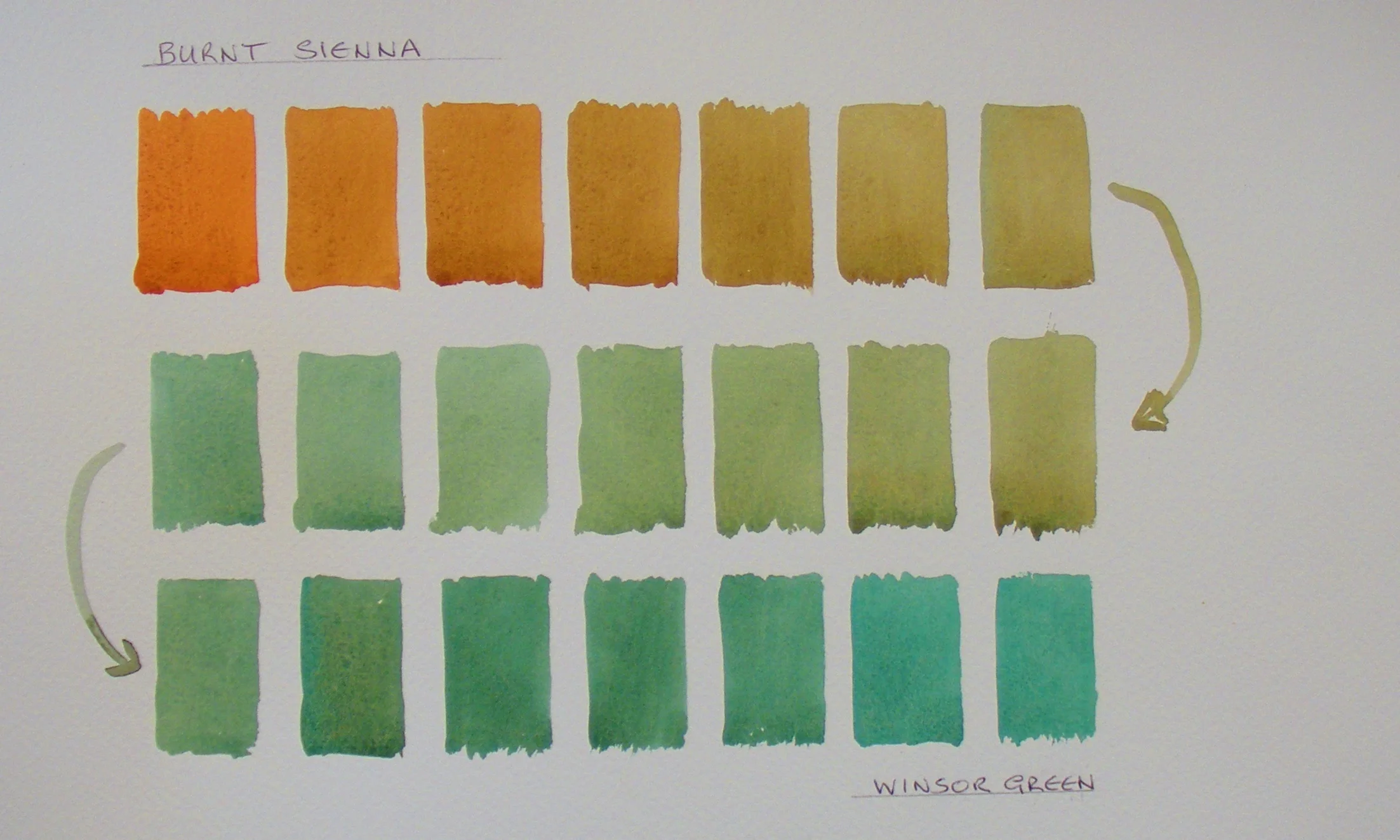
Another set of interesting greens can be made by taking a really brilliant green like Winsor Green and modifying it with the addition of an earth colour like Burnt Sienna which quickly desaturated the green and edges it towards a whole range of lovey subdued greens that shade gradually into browns. Here is my record of the journey from Burnt Sienna to Winsor Green.
By now you will realise that the variety is almost endless, forget the idea of opening a tube of Hookers Green or Viridian and just using it straight from the tube. Take your time to explore the vast range of greens that can be mixed by either desaturating intense greens with earth colours or mixing various blues with various greens.
So Fifty shades of Grey or Green or Brown is a very conservative estimate.
So to recap, here are a few general guides to help your aim.
If you are looking for clear, clean, bright greens mix yellows and blues that already tend towards green or use unmodified intense greens straight from the tube.
If you want subdued tertiary greens, mix warm yellows or earths with blues. The ‘greener’ the blue you use, the greener the mix.
OR…
Start with intense, highly saturated greens or green/blues and drag them kicking and screaming into the land of beautiful tertiaries by adding warm yellows or earth colours.
If you are looking for a large variety of neutral greys and tertiary greys, explore what happens when you mix colours opposite or nearly opposite each other on the colour wheel.
Good luck with your journey.
My next lesson will be about ‘testing’ paints to find out what exactly is in the tubes. Not their chemical composition (which is beyond me) but how they behave (or don’t) when mixed with other colours and how they affect the watercolour paper.